Soraluna
Traditional Chinese medicine faces a modern dilemma. After 2,000 years of proven healing through herbal formulations, acupuncture, and energetic diagnosis, how does this ancient practice establish credibility in contemporary western healthcare?
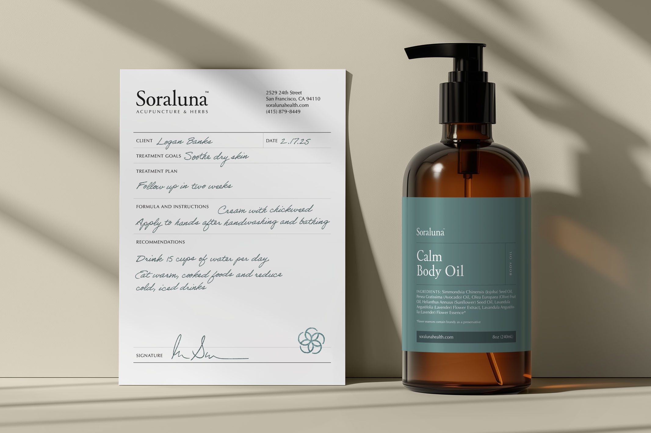
When San Francisco-based Soraluna approached us, they presented this exact challenge: positioning a traditional Chinese medicine, herb, and acupuncture practice that honored its ancient roots while meeting the expectations of today's healthcare consumers.
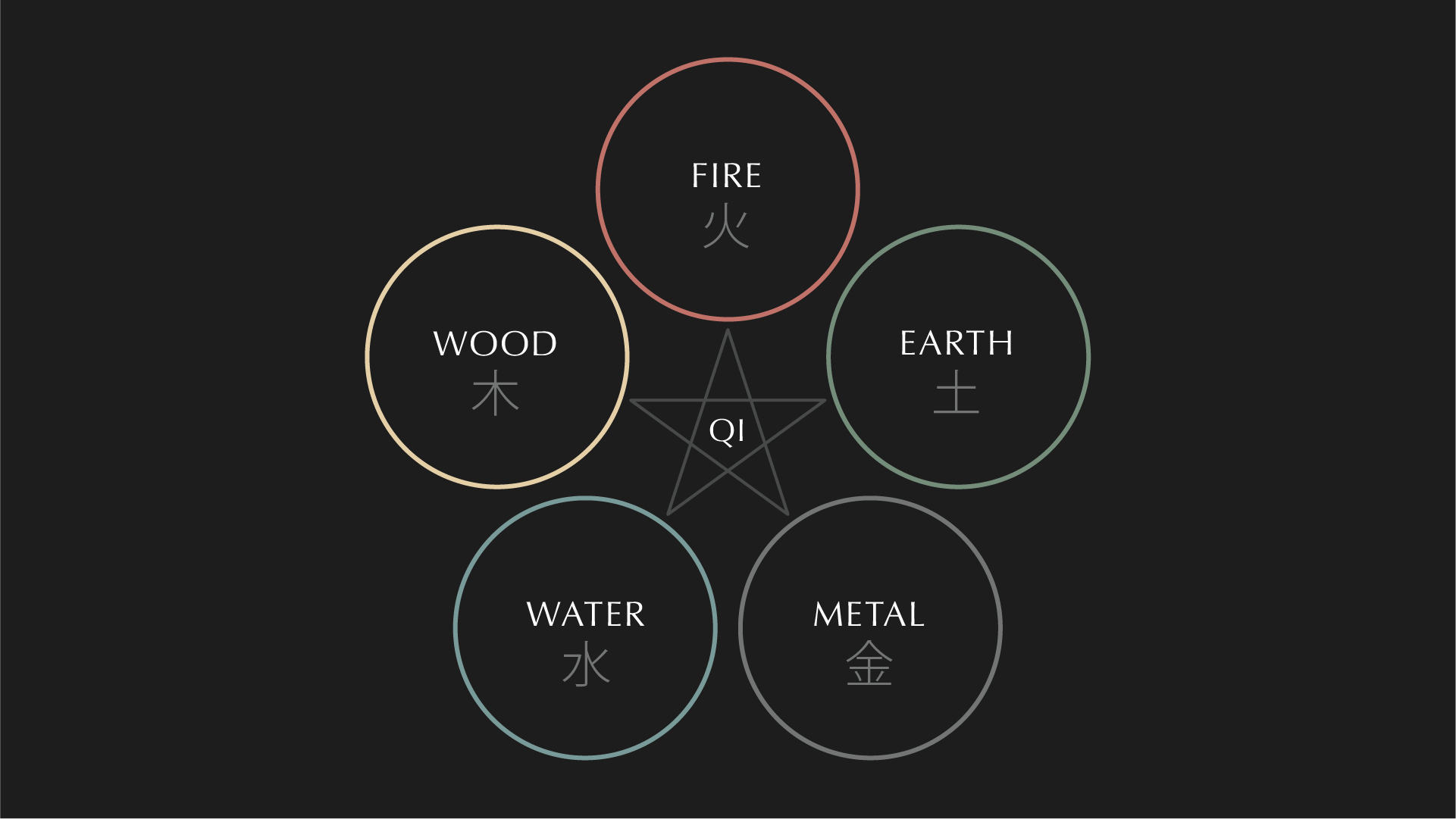
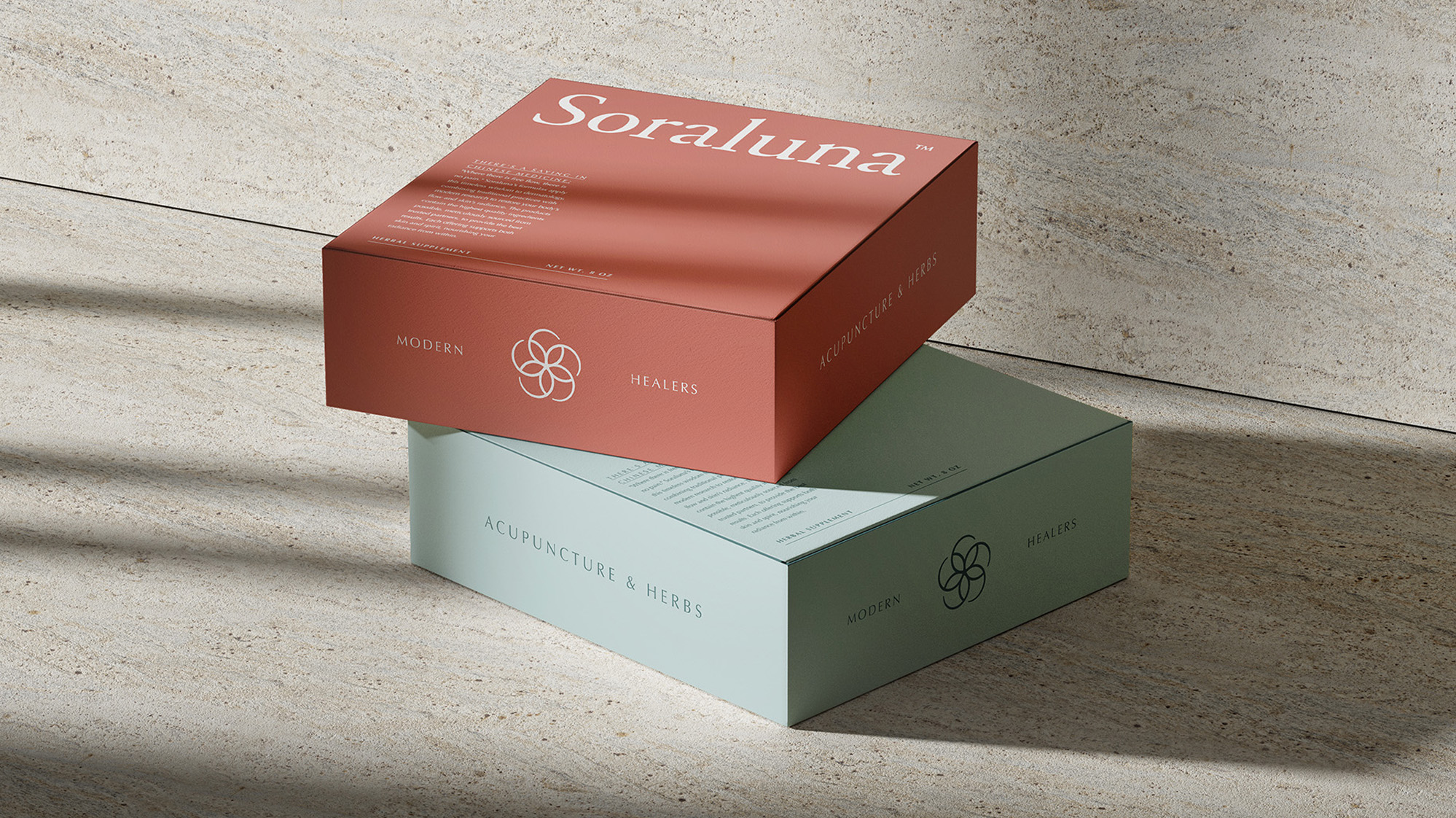
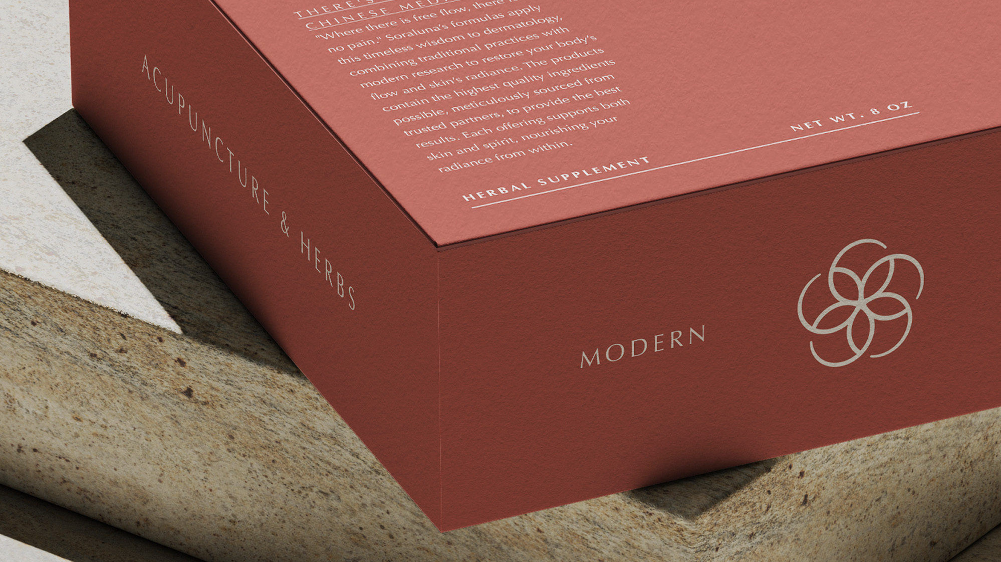
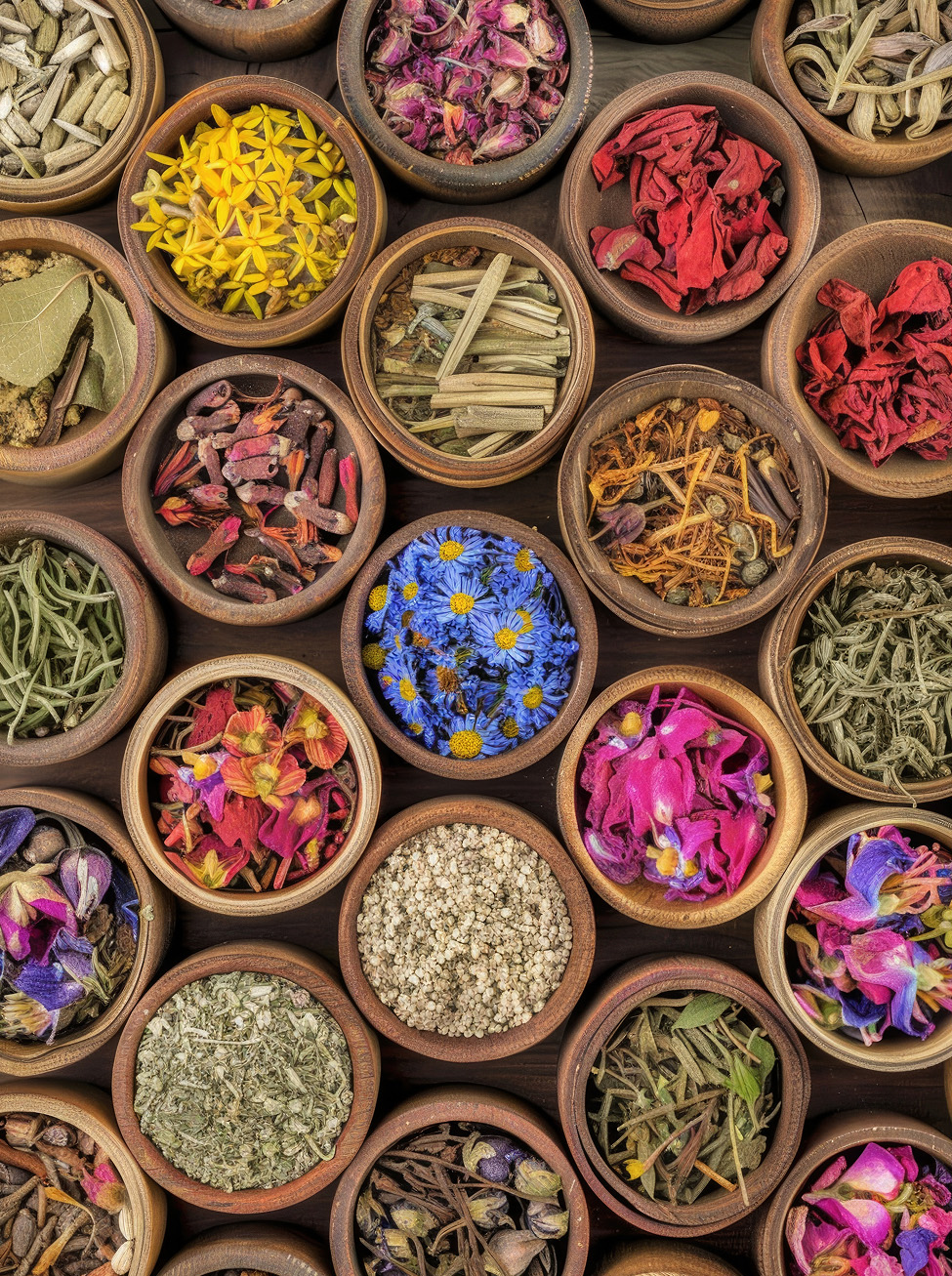
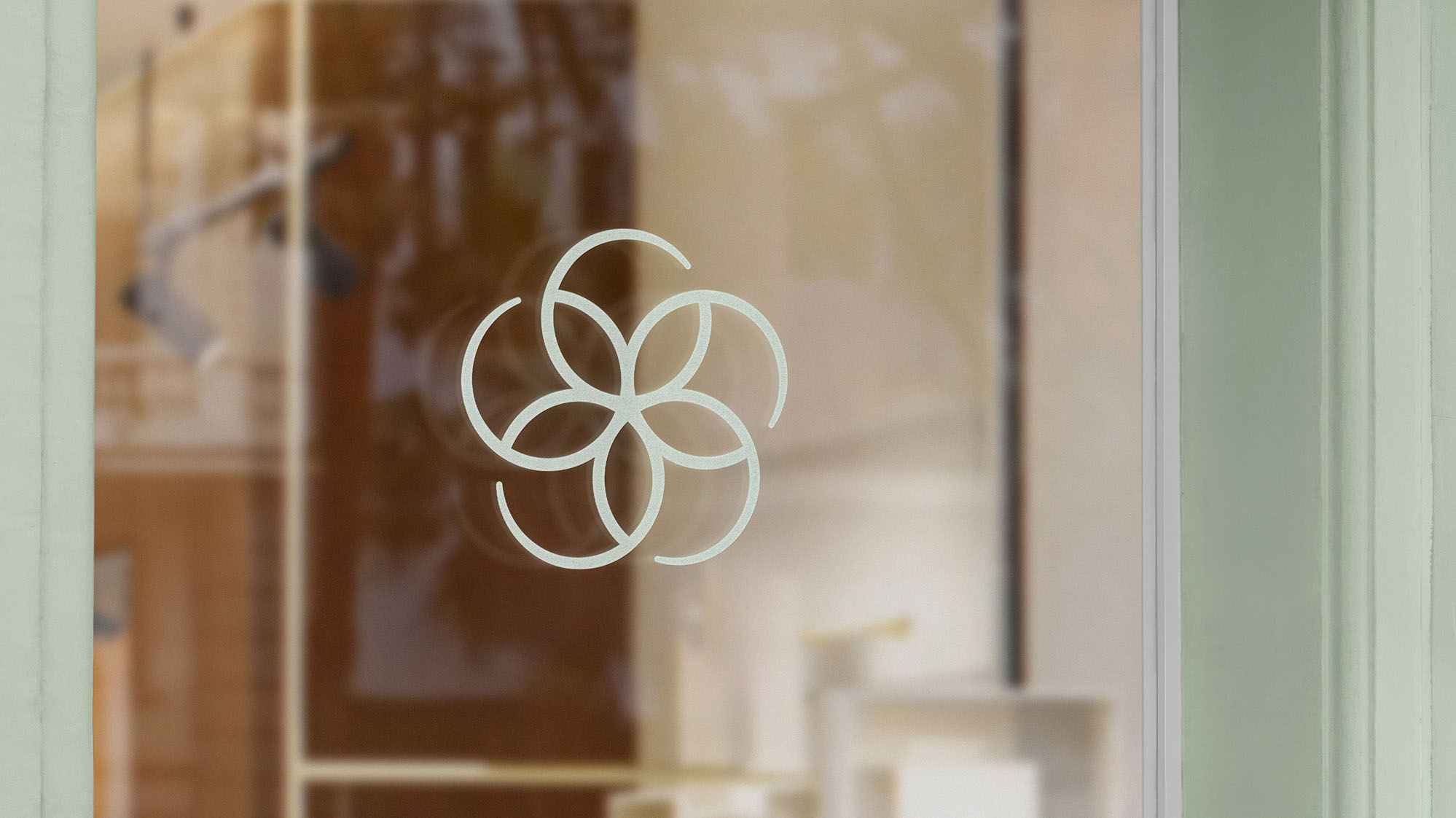
TALISMAN developed a brand identity that honors the five elements of traditional Chinese medicine (Fire, Earth, Metal, Water, Wood) while anchoring Soraluna firmly within the evolving category of integrative healthcare.
Health + Wellness, Professional Services, Consumer Brands
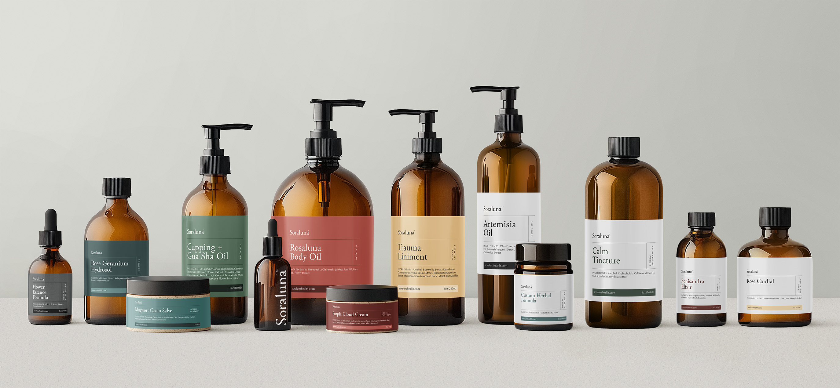
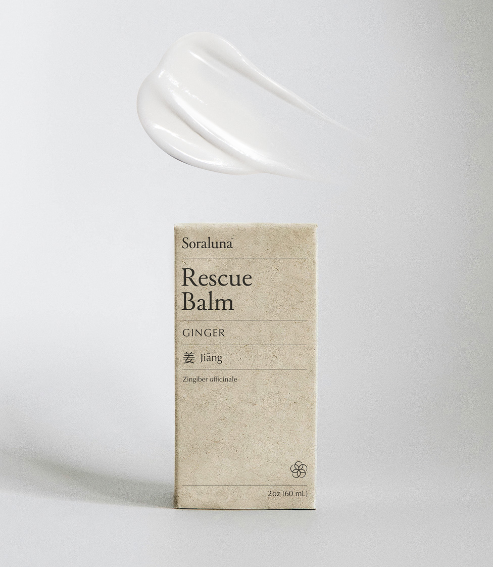
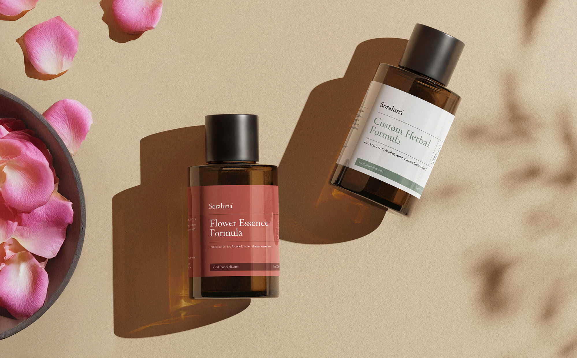
Identity, Package Design
Silvia Diffenderfer
Jacob Kemp
Timia Lewis
Luke Meyer
Morgan Moscinski
Liana Pavane
Lena Rose
Natalie West
Elizabeth Swartz, Owner + Founder
Rob Alba Studio Lettering

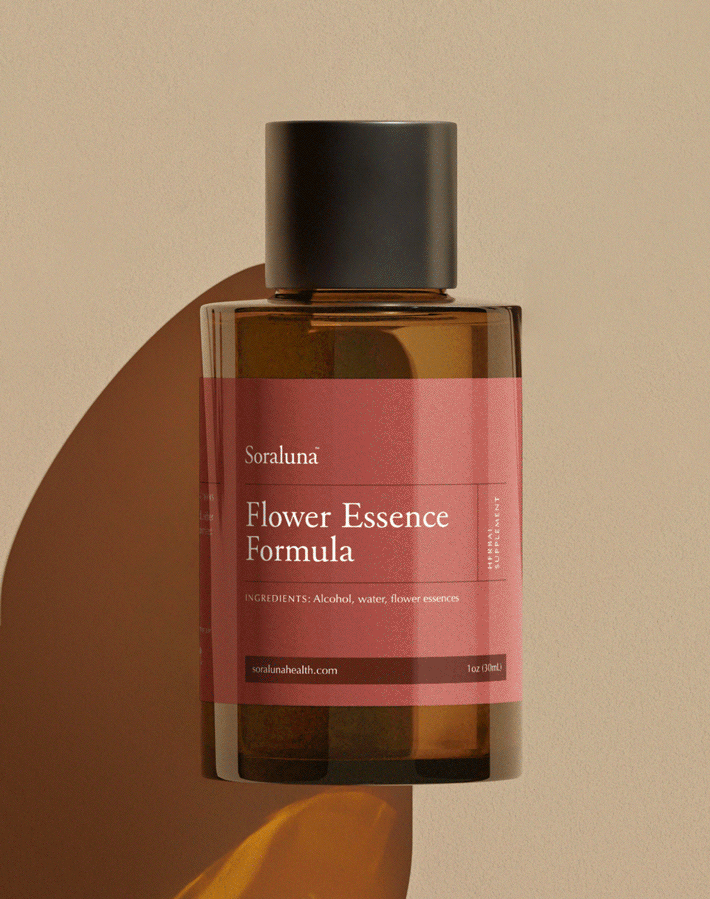
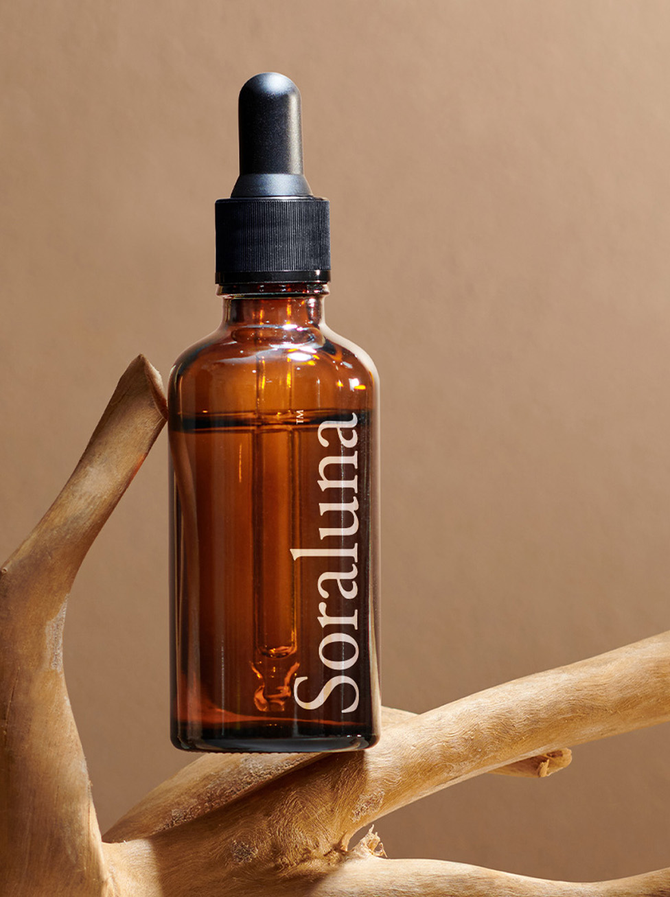
The custom Soraluna Serif balances classical proportions with modern refinement, featuring subtle details that reference traditional medical texts while maintaining exceptional readability across all applications. The typographic system aims to allow the brand to communicate complex medical concepts with clarity while honoring the depth and sophistication of traditional Chinese medicine.

Keep Exploring