Hands On
For over 40 years, HandsOn has been at the forefront of Sign Language interpreted performances for New York's vibrant arts arena, as well as providing resources, training, and events on live arts accessibility across the United States.
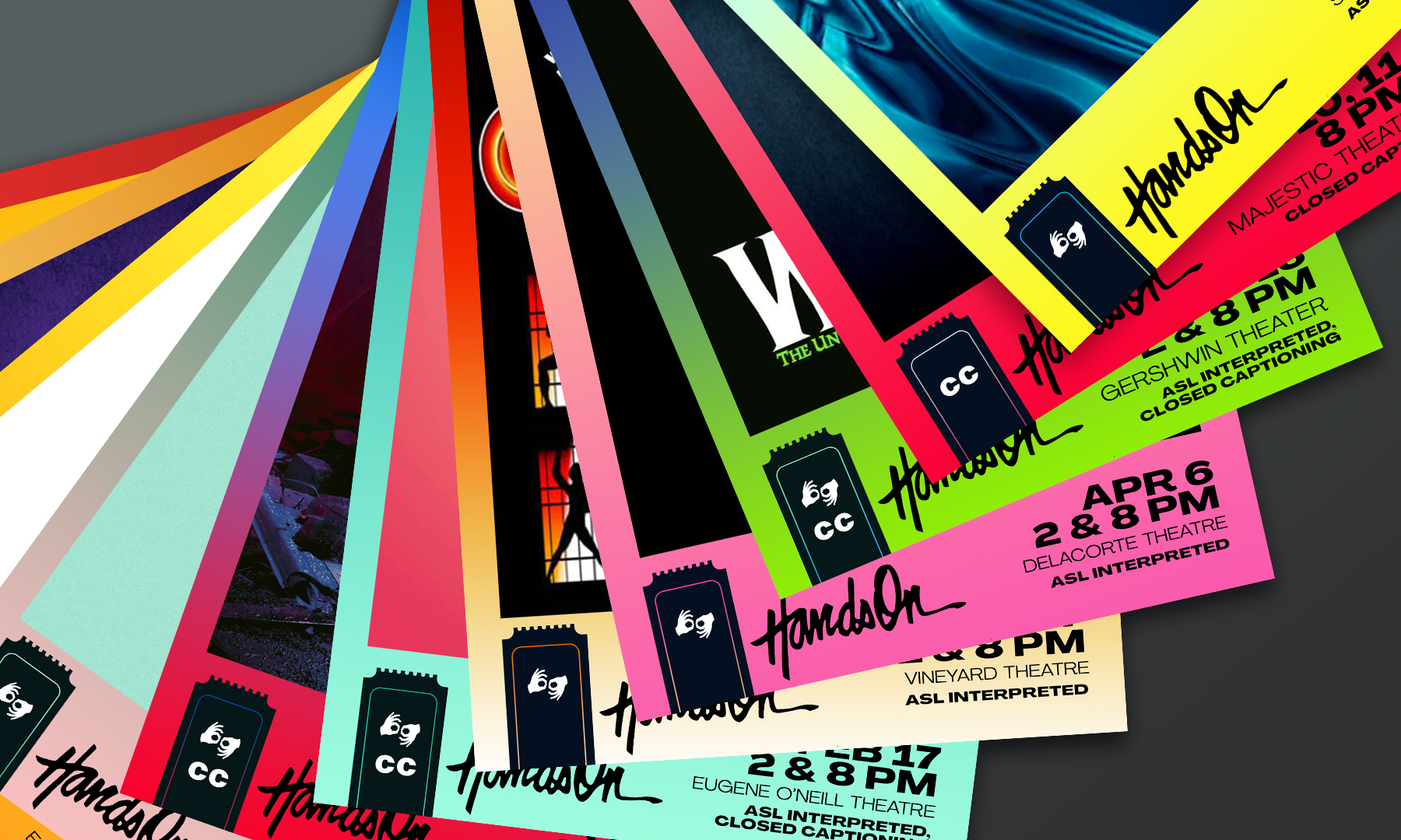
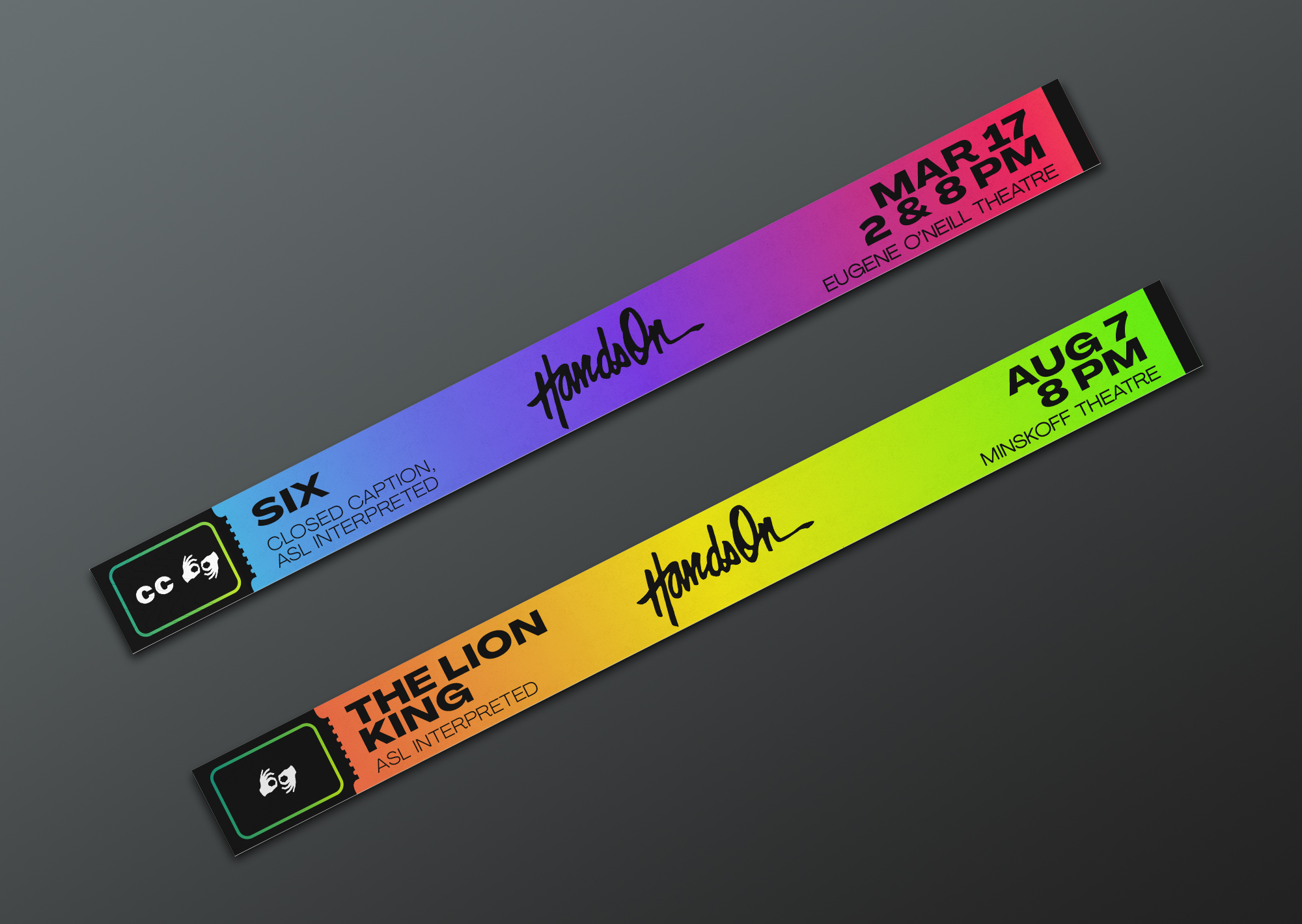
With over 20-30 interpreted Broadway and Off-Broadway productions in a calendar year, HandsOn's extensive appearances require a distinctive but flexible brand identity framework to integrate within the visual worlds of different cultural institutions, each individual show's key art, or multiple productions at one time.
The TALISMAN team worked closely with HandsOn to strategize how an interpreted performance would integrate into the marketing campaign for a single production, or also highlighted as a special event. The design framework needed to reflect the collaborative nature of Sign-interpreted performance: at its best, Sign-interpretation of a production should be fully-integrated, never invisible; the performers welcomed as a celebrated part of the storytelling team.
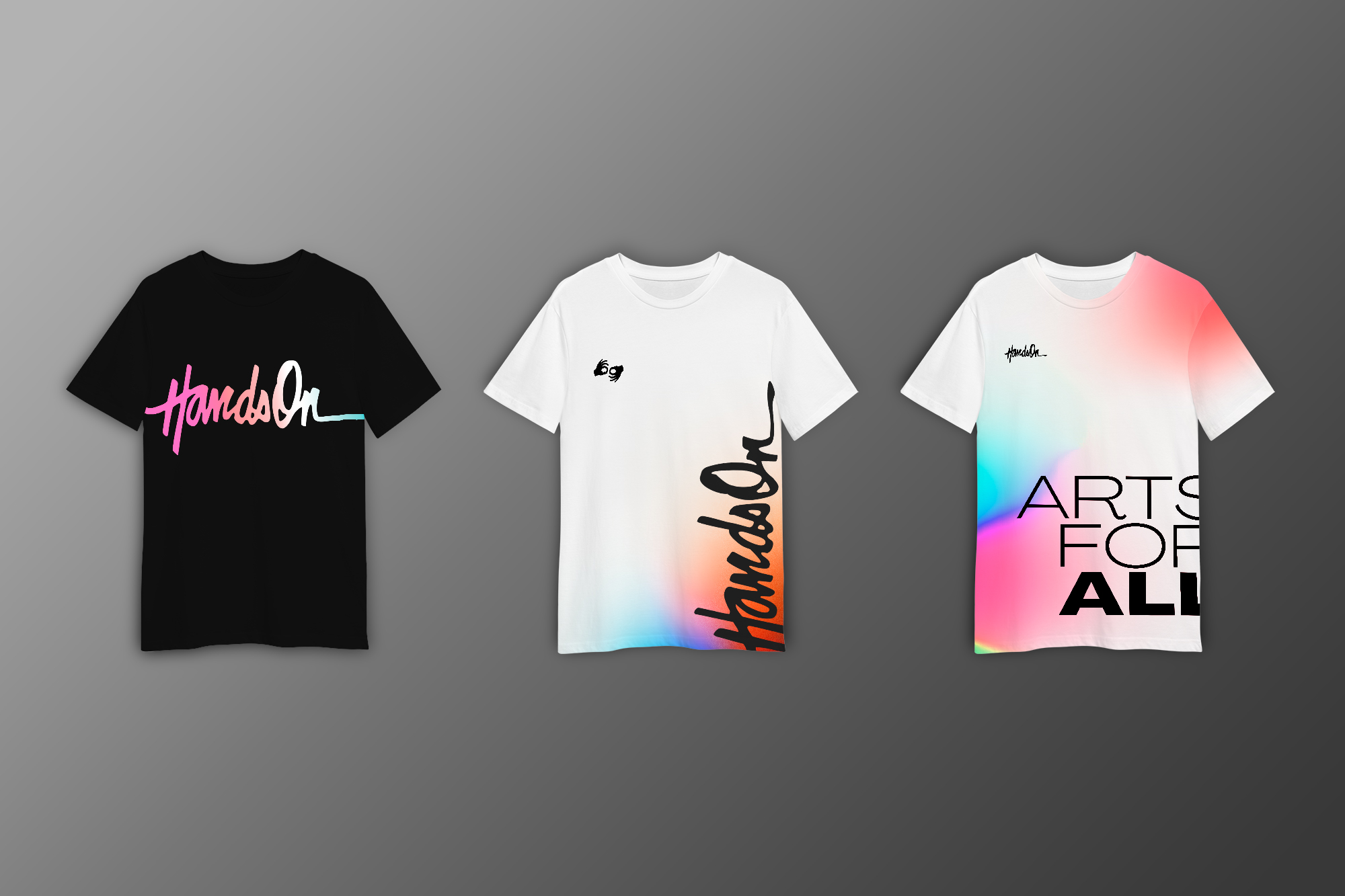
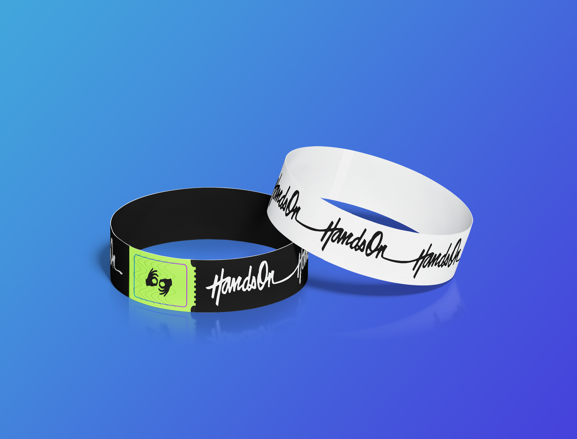
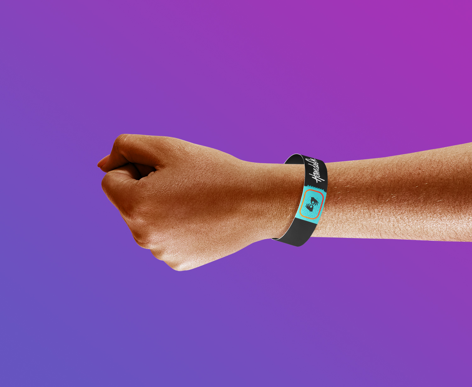
The aesthetic of the graphics reflects a contemporary, visible, and energetic presence. This also ties into HandsOn’s larger mission and the message of ‘arts for all’ – with 15% of the global population identifying as having a disability, they remain the world’s largest marginalized group, and all too often forgotten when inclusivity is discussed for arts organizations. The design aspires to capture public attention in a creative, engaging and imaginative way. Legibility and clarity, more than ever, was vital for this project, ensuring communications from HandsOn feel artful, impactful, and accessible to all.
Art + Entertainment, Professional Services
Brand Identity, Print Design, Motion Design, Communications
Jacob Kemp
Lena Rose
Morgan Moscinski
Terra Mackintosh
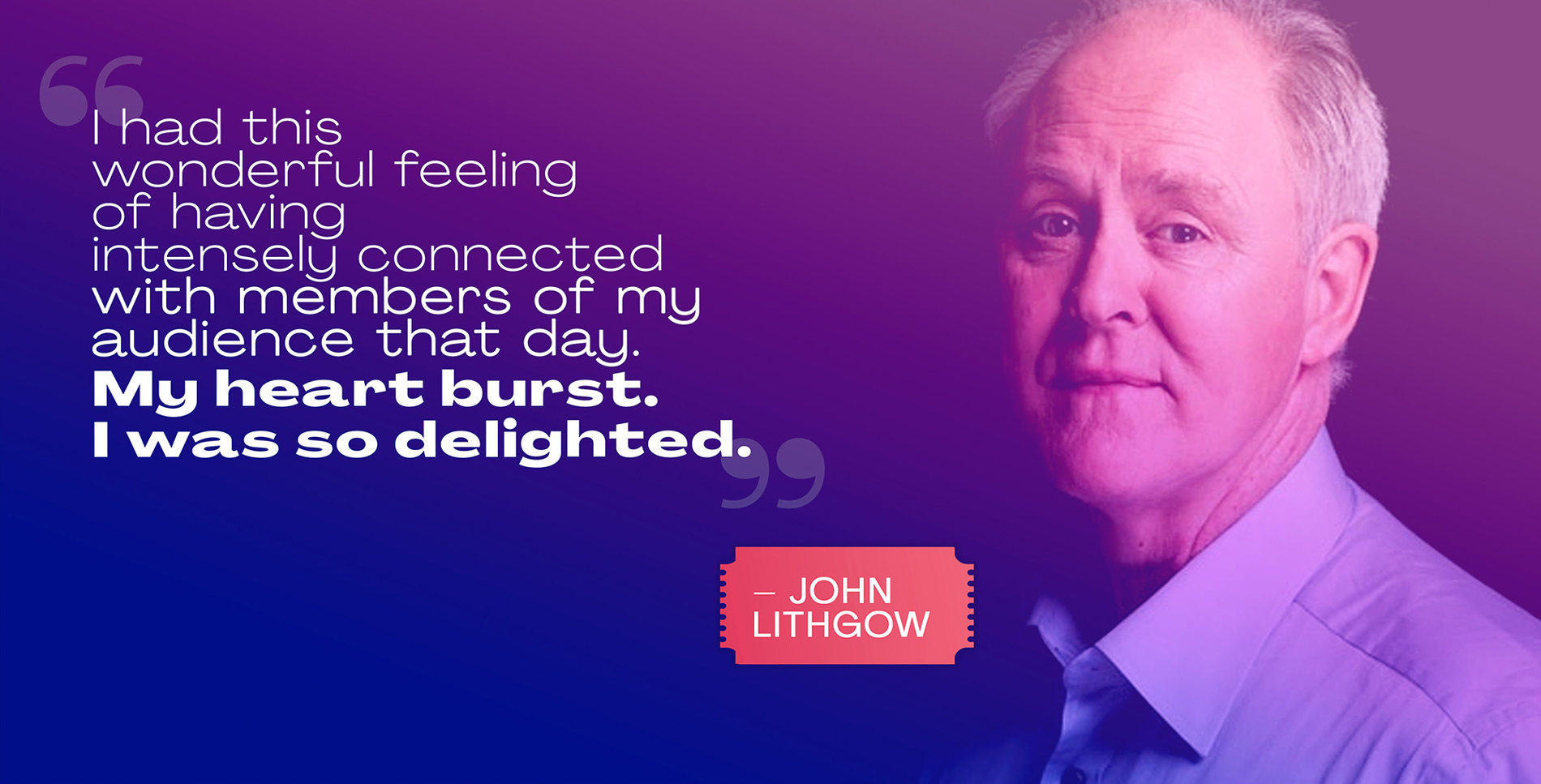
Beth Prevor, Founder & Director
Hirsch Fishman
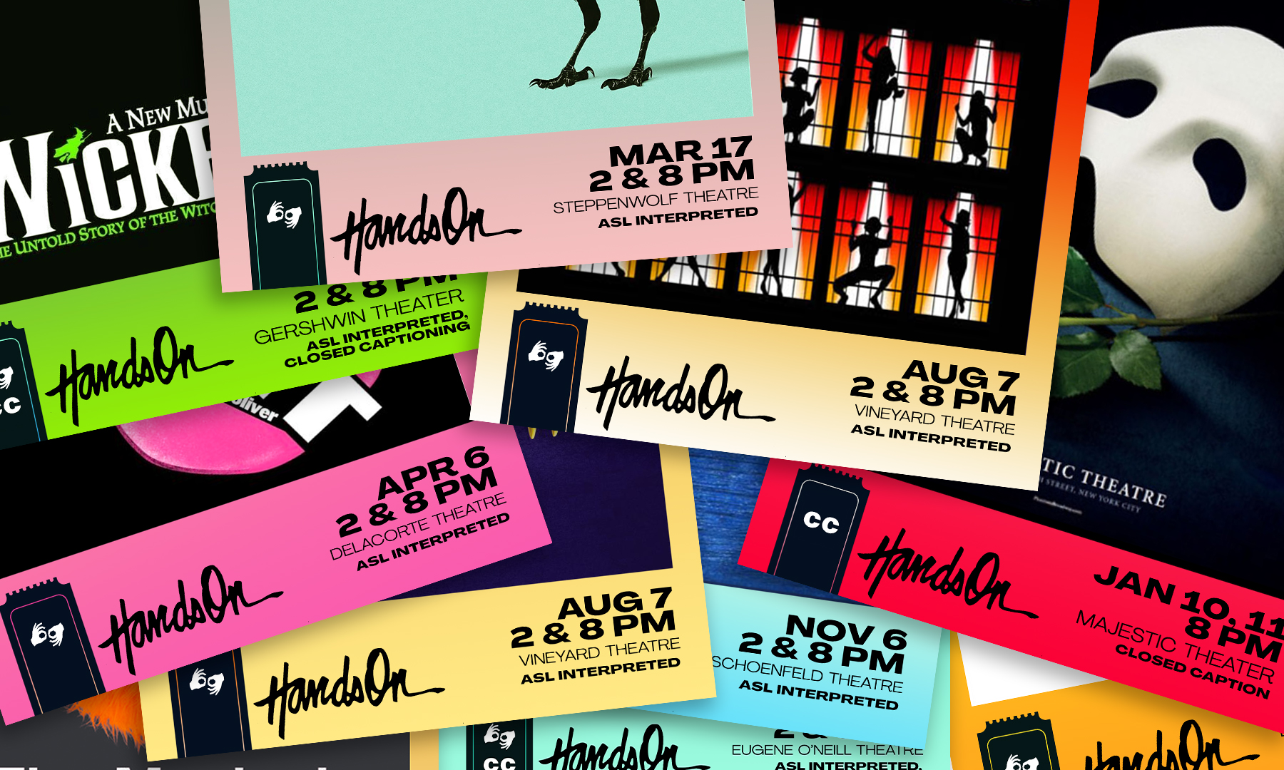
With more than 20 interpreted Broadway and Off-Broadway productions in a calendar year, HandsOn's extensive appearances require a distinctive but flexible brand identity framework.

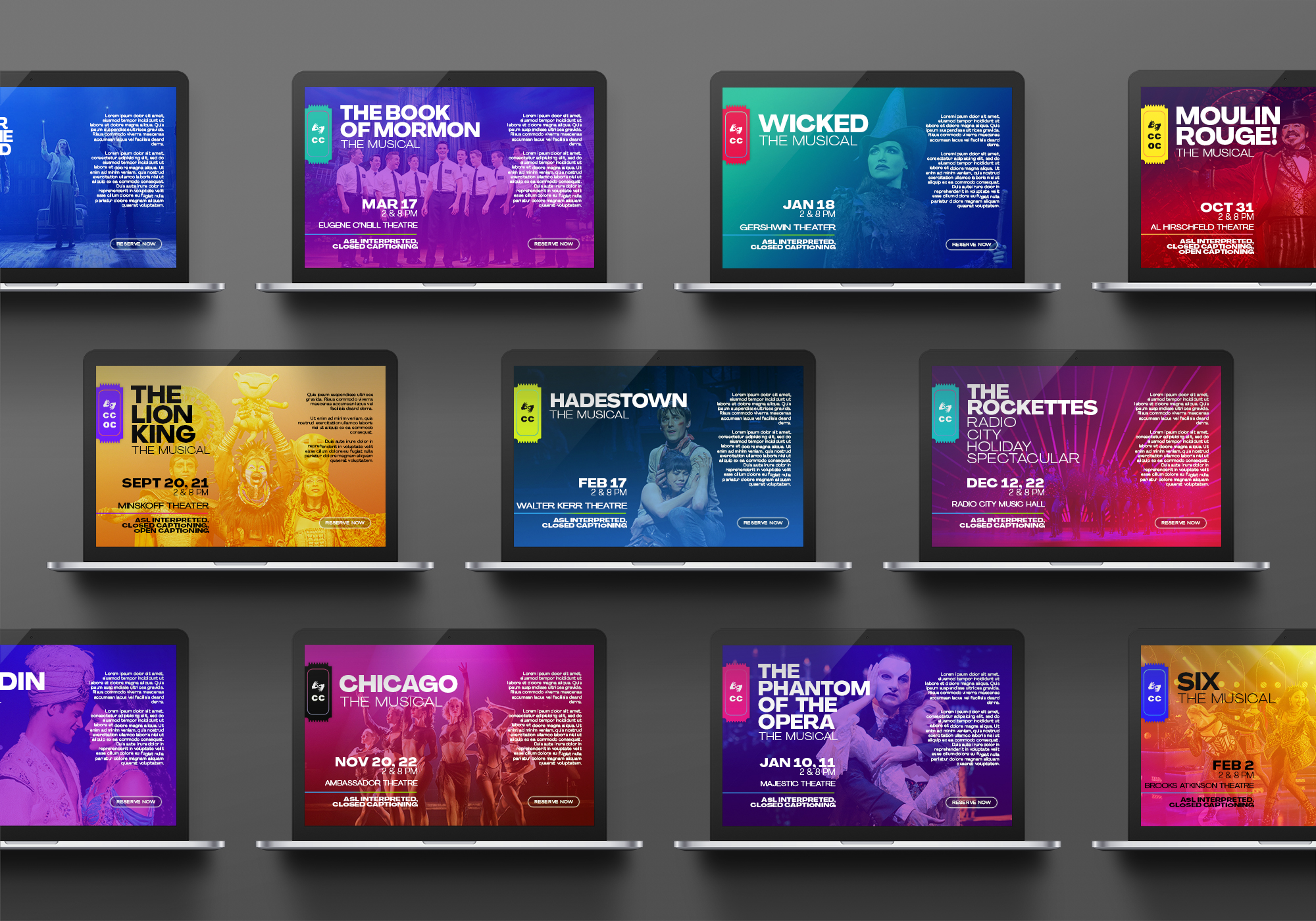
Legibility and clarity, more than ever, was vital for this project, ensuring communications from HandsOn feel artful, impactful, and accessible to all.
At its best, Sign-interpretation of a production should be fully-integrated, never invisible; the performers welcomed as a celebrated part of the storytelling team.
Keep Exploring