For the best viewing experience, you must enable Javascript to access this site.

Everyman @ 30

Anniversary Season Design

Staging a celebration of the theater, past and present. Typographic ‘somersault’ logo variations and a hidden-message illustrated poster series were revealed in animation and interaction design as part of an unprecedented integrated marketing campaign.

The hidden "30" moves throughout each poster, in homage to the celebrated Resident Company members who are seen throughout the productions each year. Hidden ‘Easter eggs’ offer season subscribers and theater lovers joyous moments of recognition and revelation. If you know, you know.

Sector

Art + Entertainment

Discipline

Identity, Campaign, Illustration, Art Direction, Video, Motion, Sound, Key Art, Positioning

Team
TALISMAN

Jacob Kemp

Morgan Moscinski

Lena Rose

Noah Himmelstein

Everyman Theatre

Amy Lebo, Director of Marketing + Strategic Communications
Vincent M. Lancisi, Founding Artistic Director
Paige Hernandez, Associate Artistic Director
Noah Himmelstein, Associate Artistic Director
Stephanie Moore, Director of Development
Marissa LaRose, Managing Director
Kyle Prue, Producing Director
Madeline ‘Mo’ Oslejsek, Multimedia Manager

Partners

Mathieu Maillefer

Joe Kye

Tiphaine Illustration

Tommy Huang

The iconic “E is for Everyman” mask logo is flipped in a jester-like gesture, a quick and fun reference to 30 years of stagecraft and leadership in the American arts.
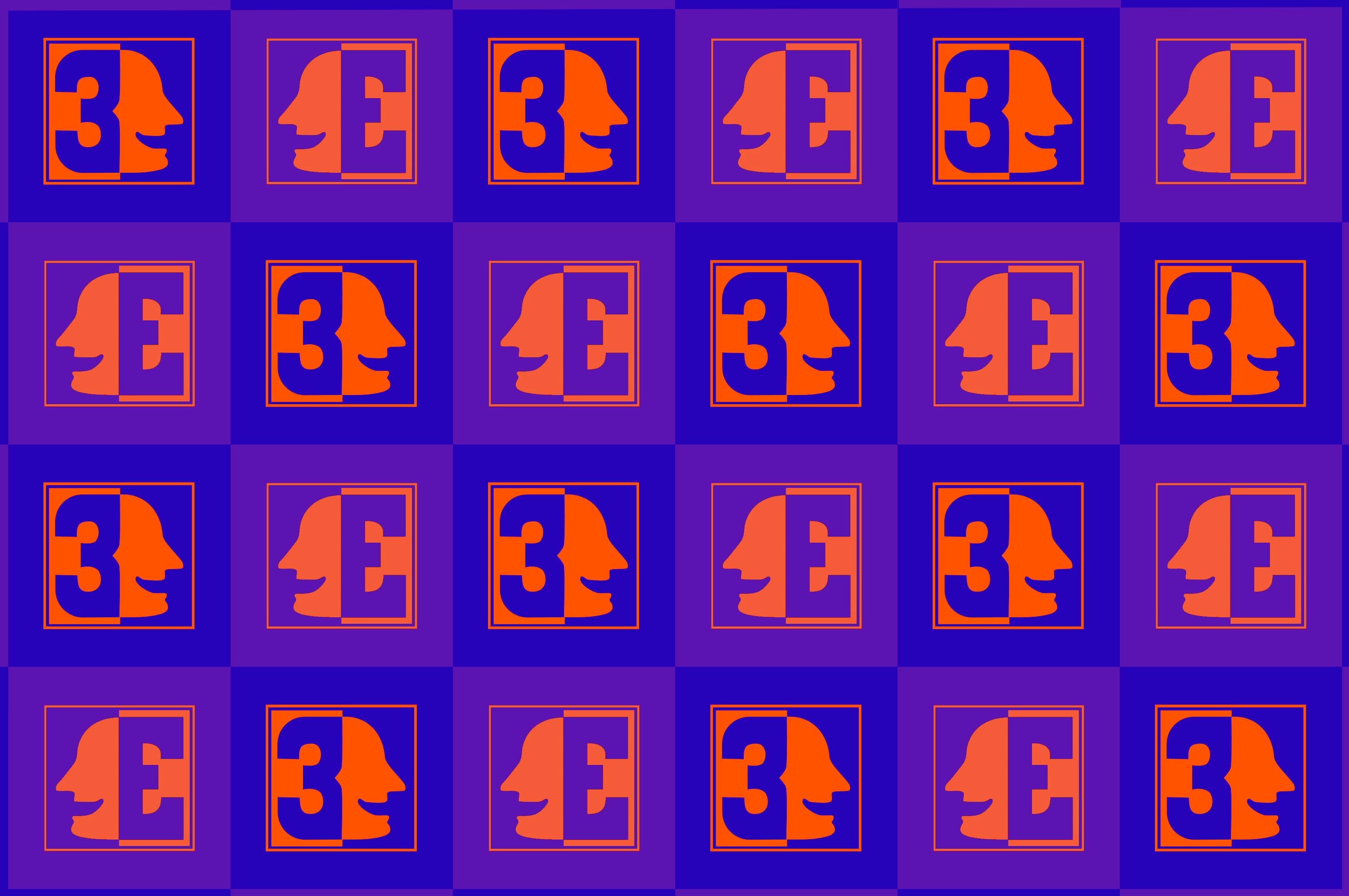
This is a repeating grid of logos for the 30th season of Everyman Theatre Company. The logo features a 3, which can flip almost perfectly to be an E and the silhouette or a mask. The colors alternate between two shades of purple and one orange.

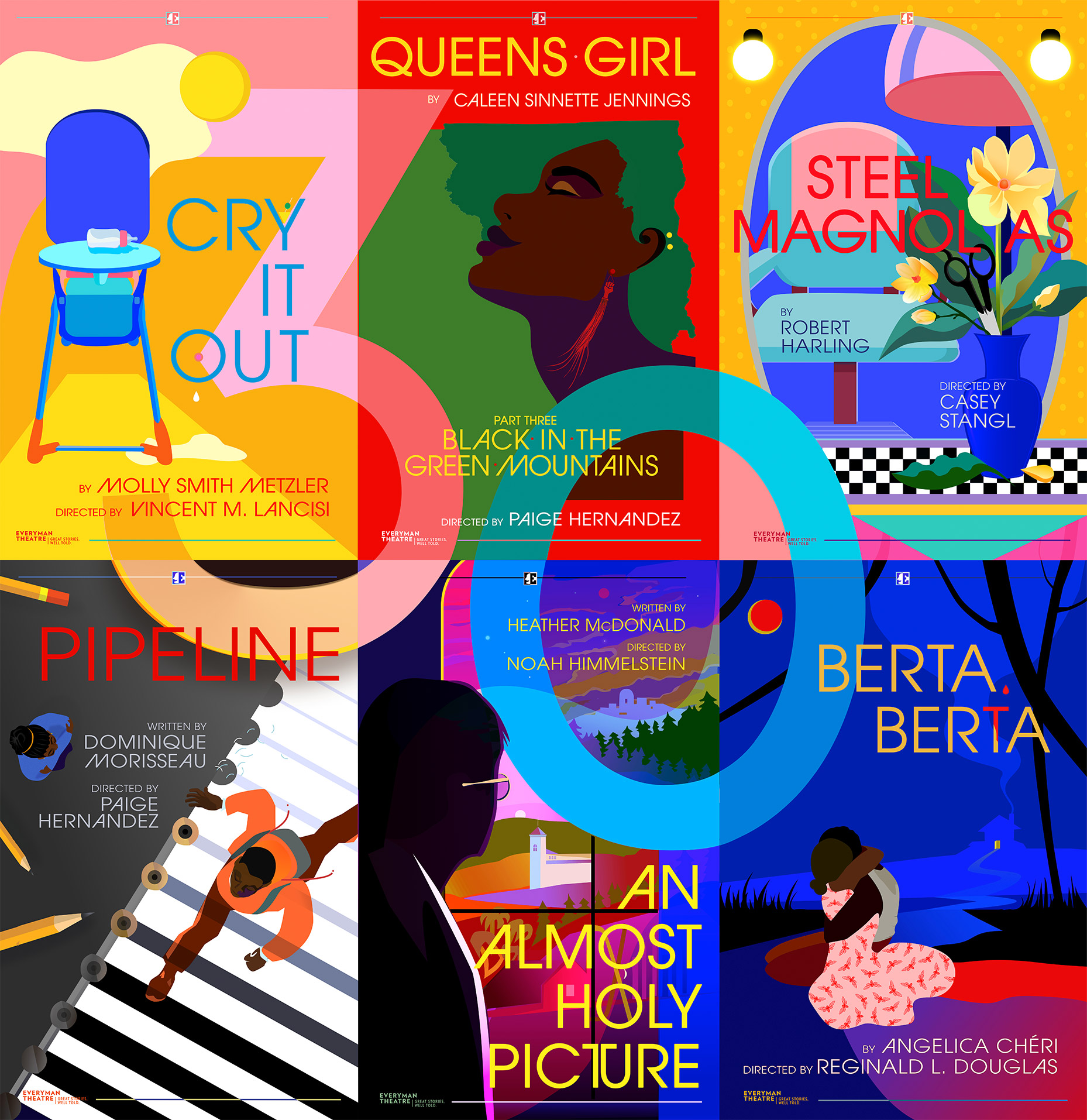
Each poster for the season, when placed together, spells out a hidden “30” used in the color-blocked poster illustrations. Negative space and illustrative details in each poster reflect upon themes, images, or characters from the plays themselves.
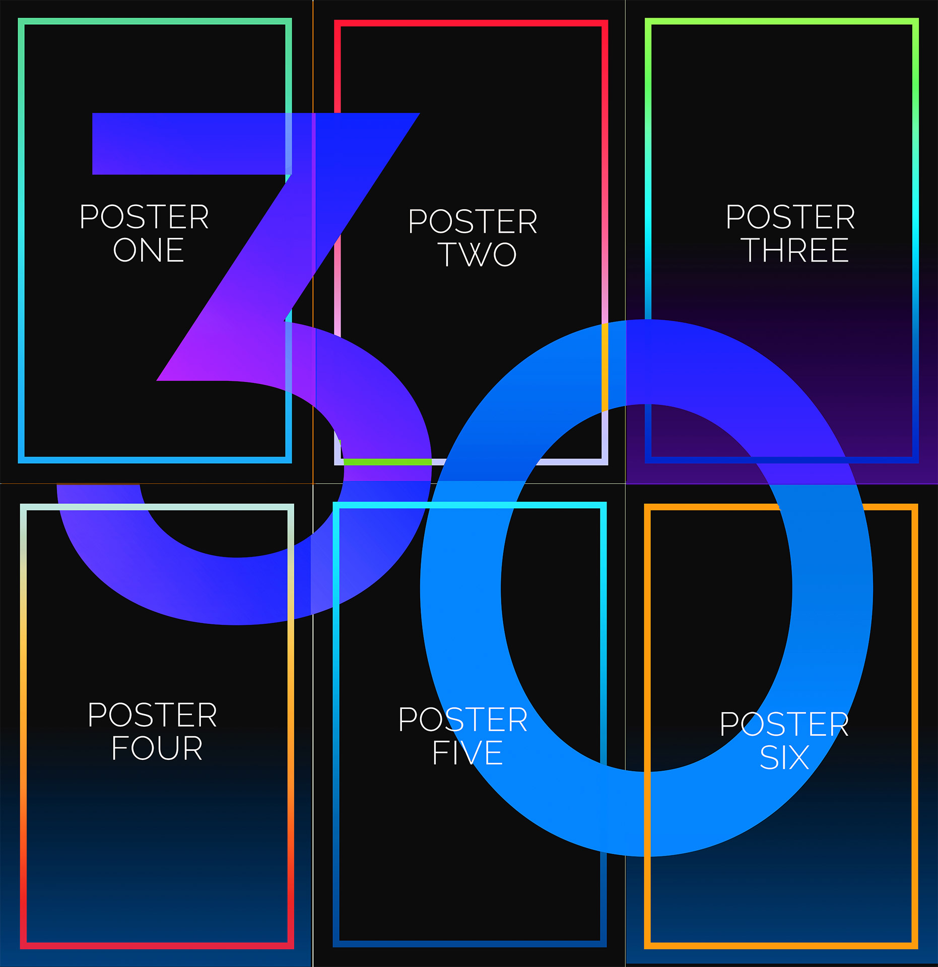
This is an image of the blank template of Everyman Theatre Company's 30th season show lineup. The theater posters are designed to be laid out in a 3x2 grid, and a large "30 spans across all 60.
This is an image of the filled out template of Everyman Theatre Company's 30th season show lineup. The theater posters are laid out in a 3x2 grid, and a large "30 spans across all 6, which are "Cry it Out" "Queen's Girl" Steel Magnolias" "Pipeline" "an Almost Holy Picture" and "Berta Berta". There is a unified illustration style and color harmony.
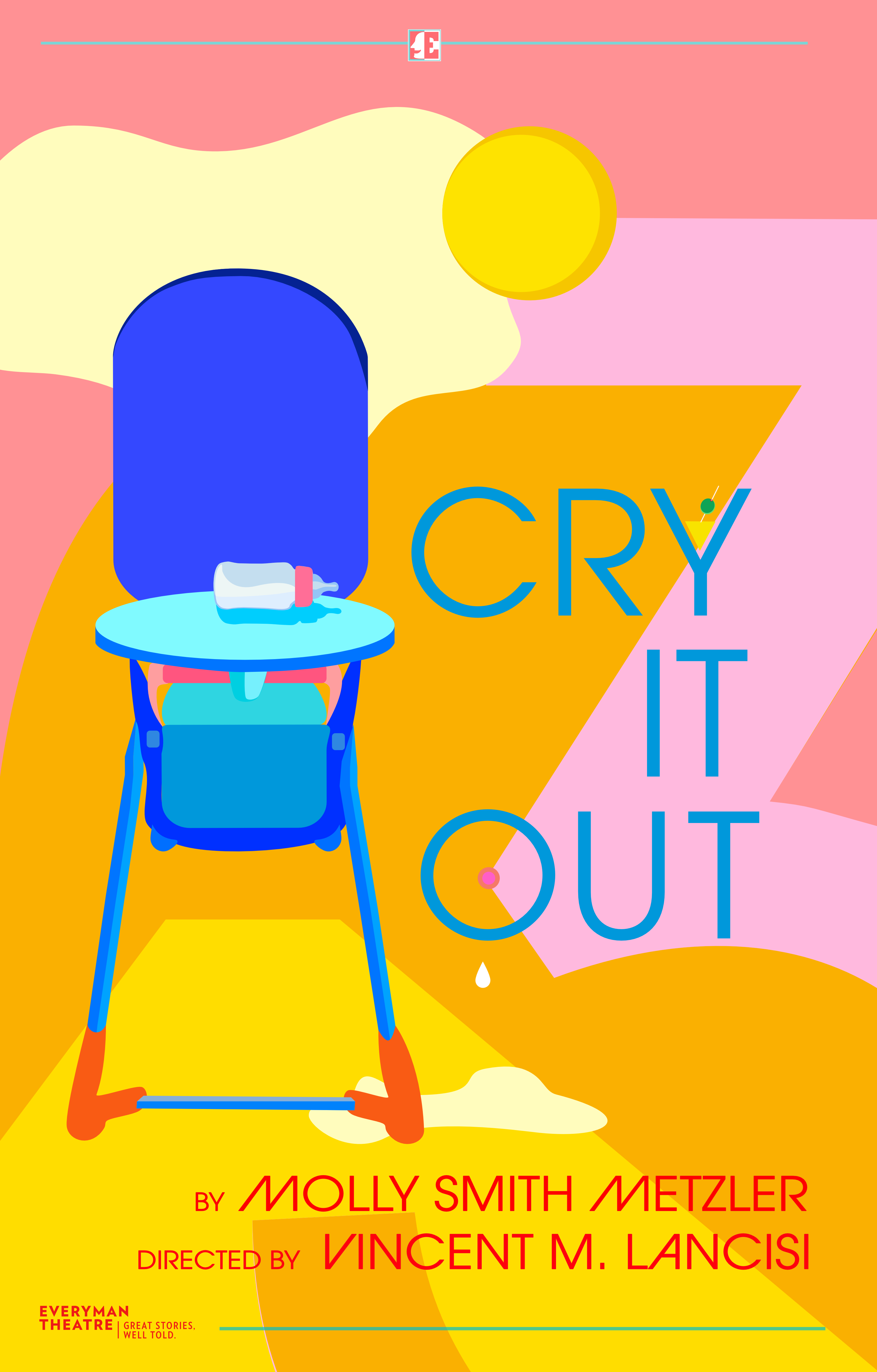
This is an image of a theater poster designed for the Everyman Theater Company's 30th season, specifically, of the production "Cry It Out". The illustration style is flat, and features an image of a baby feeding chair and part of a "3" woven into the background, which is very colorful.
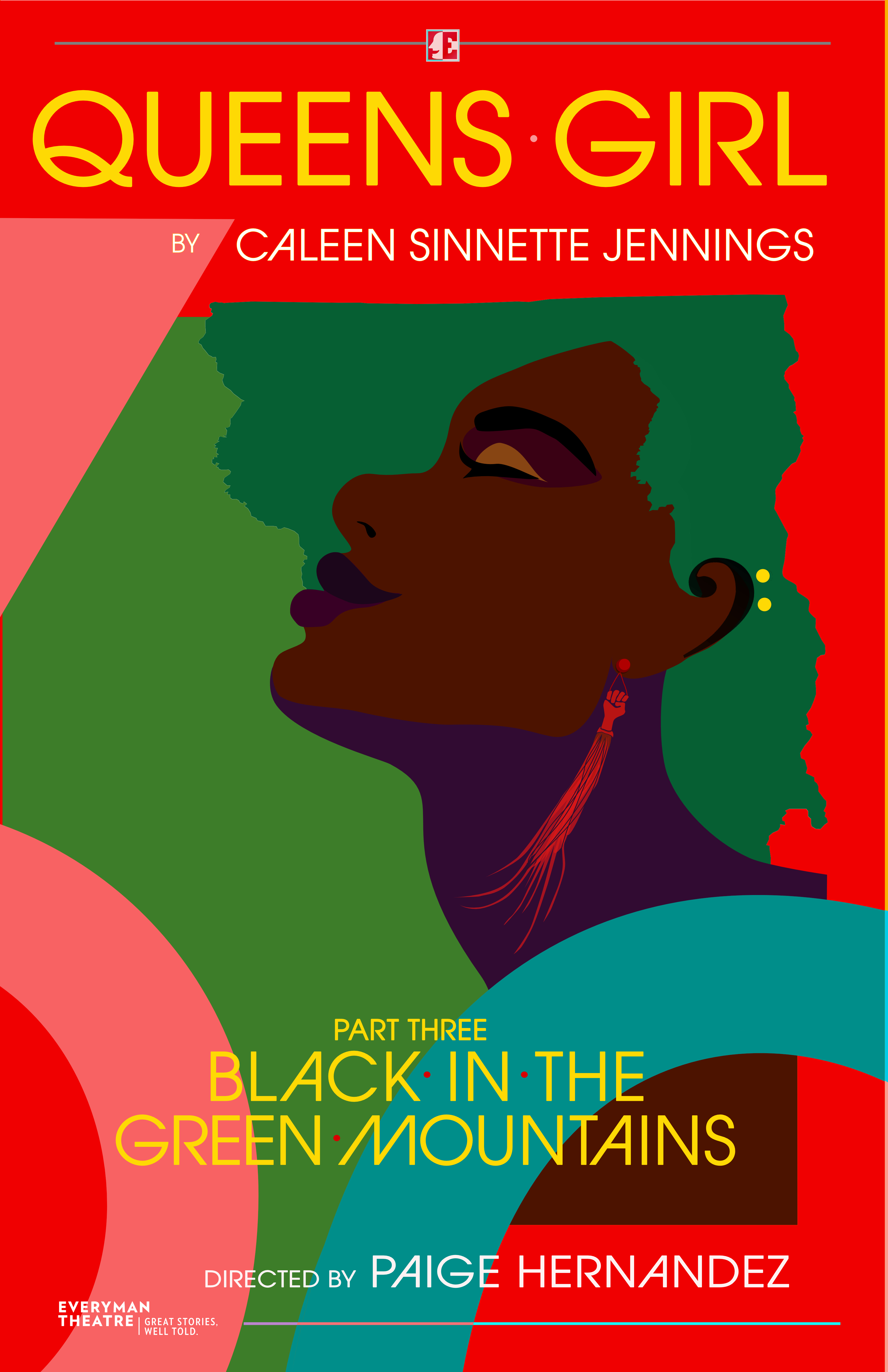
This is an image of a theater poster designed for the Everyman Theater Company's 30th season, specifically, of the production "Queen's Girl Part Three: Black in the Green mountains". The illustration is in a flat style, and features a side profile of a black woman with a green afro tipping her head back as if listening to music. Both part of a "3" and a "0" are woven into the background.
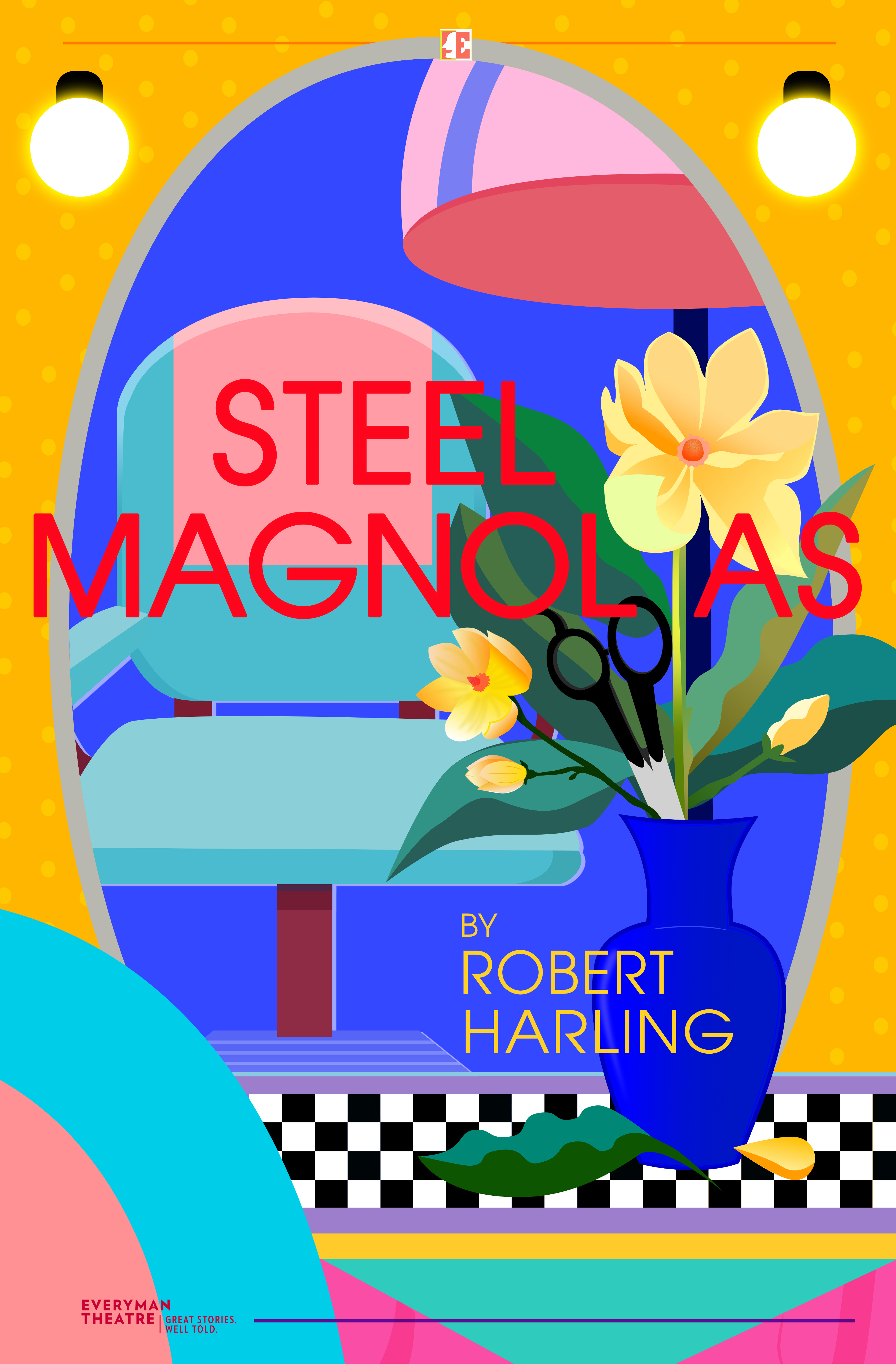
This is an image of a theater poster designed for the Everyman Theater Company's 30th season, specifically, of the production "Steel Magnolias". The illustration is in a flat style, and features a vase of magnolia flowers. Part of a "3" and is woven into the colorful background.
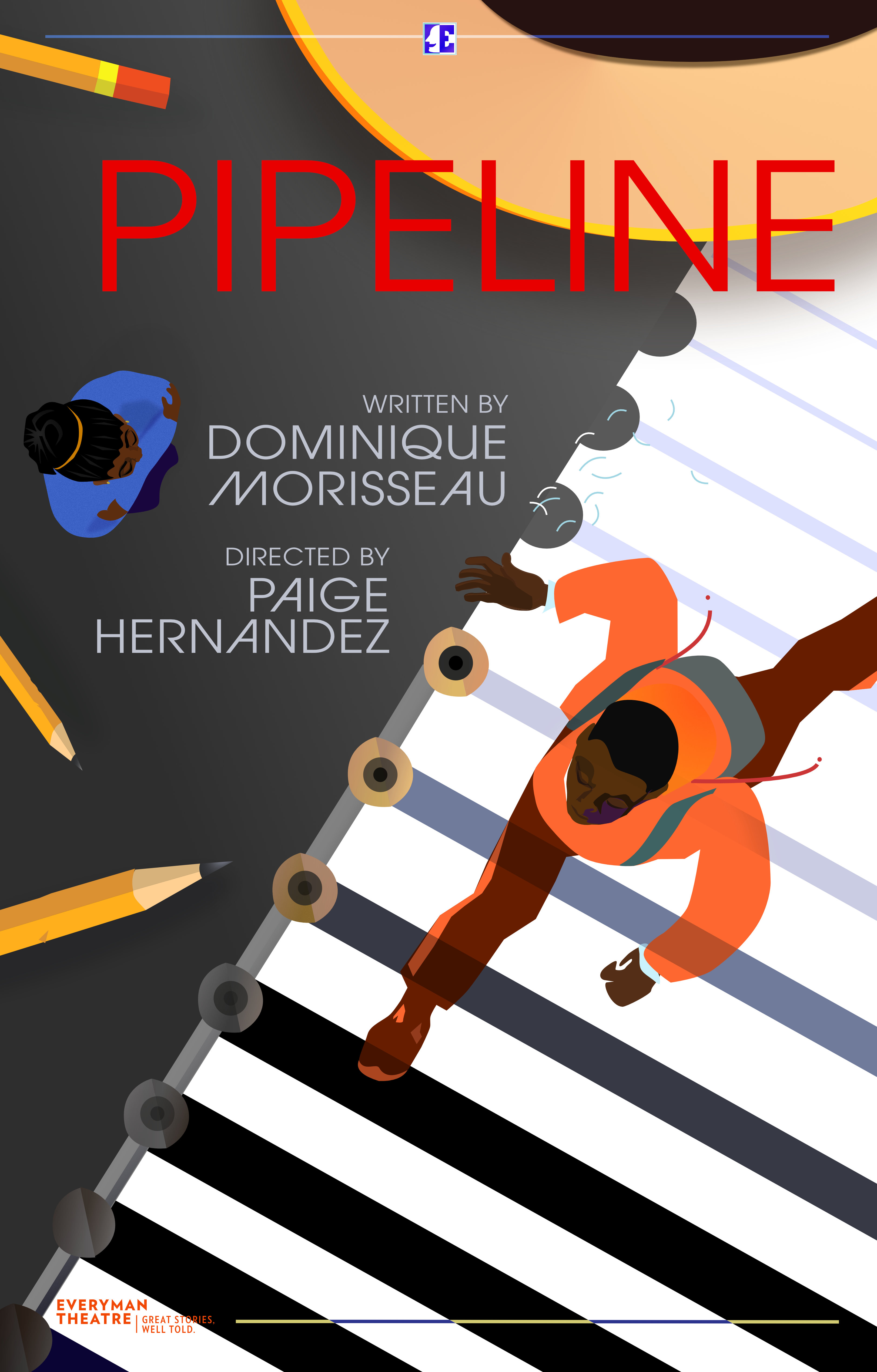
This is an image of a theater poster designed for the Everyman Theater Company's 30th season, specifically, of the production "Pipeline". The illustration is in a flat style, and features a birds eye view of a person walking across a crosswalk, but the crosswalk is actually a sheet of notebook paper and large pencils are scattered around it . Part of a "0" is woven into the background.
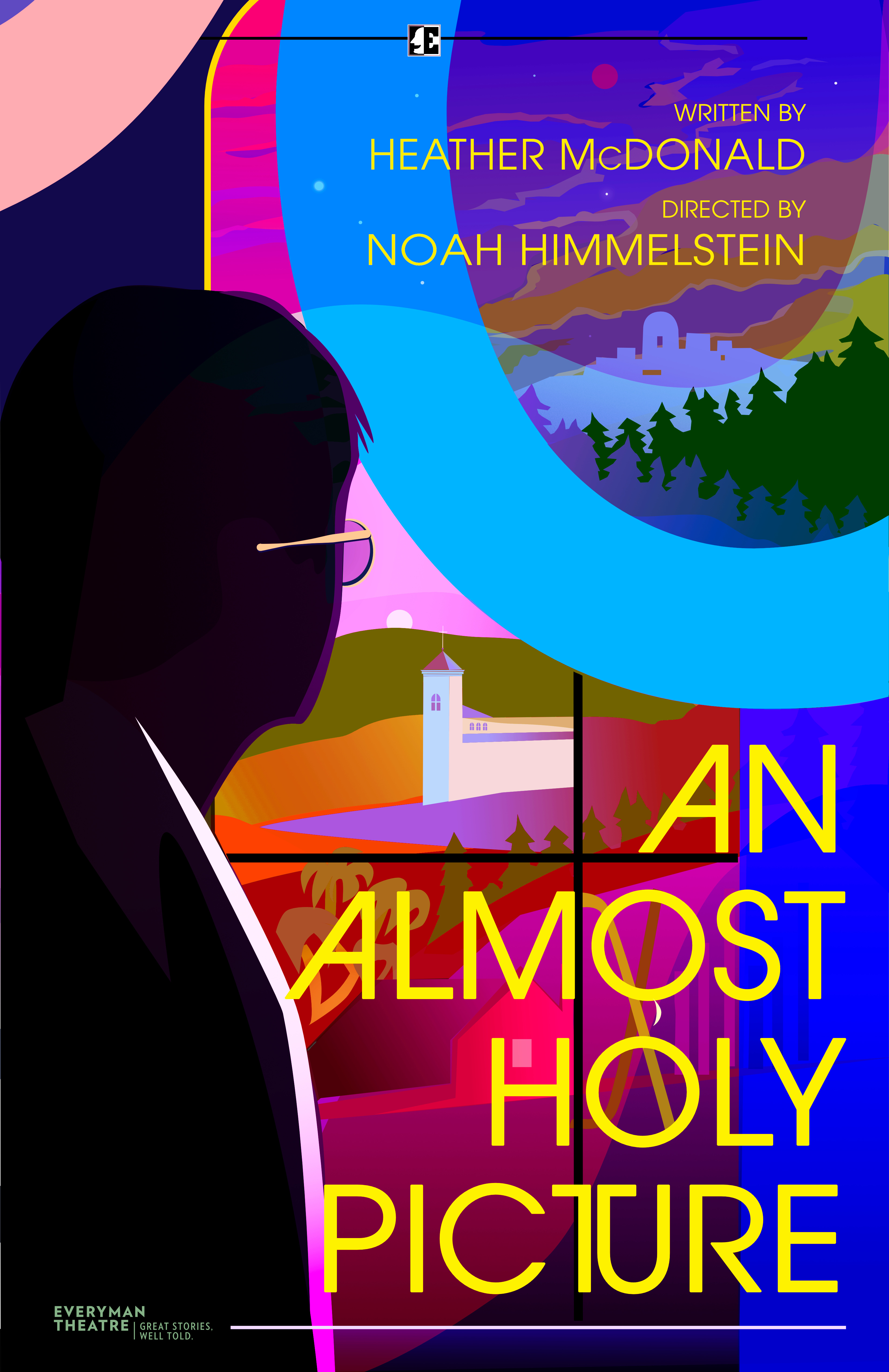
This is an image of a theater poster designed for the Everyman Theater Company's 30th season, specifically, of the production "An Almost Holy Picture". The illustration style is flat, and features the silhouette of a person wearing glasses gazing off at a forested scene with a walled city far in the distance. Both part of a "3" and a "0" are woven into the background.
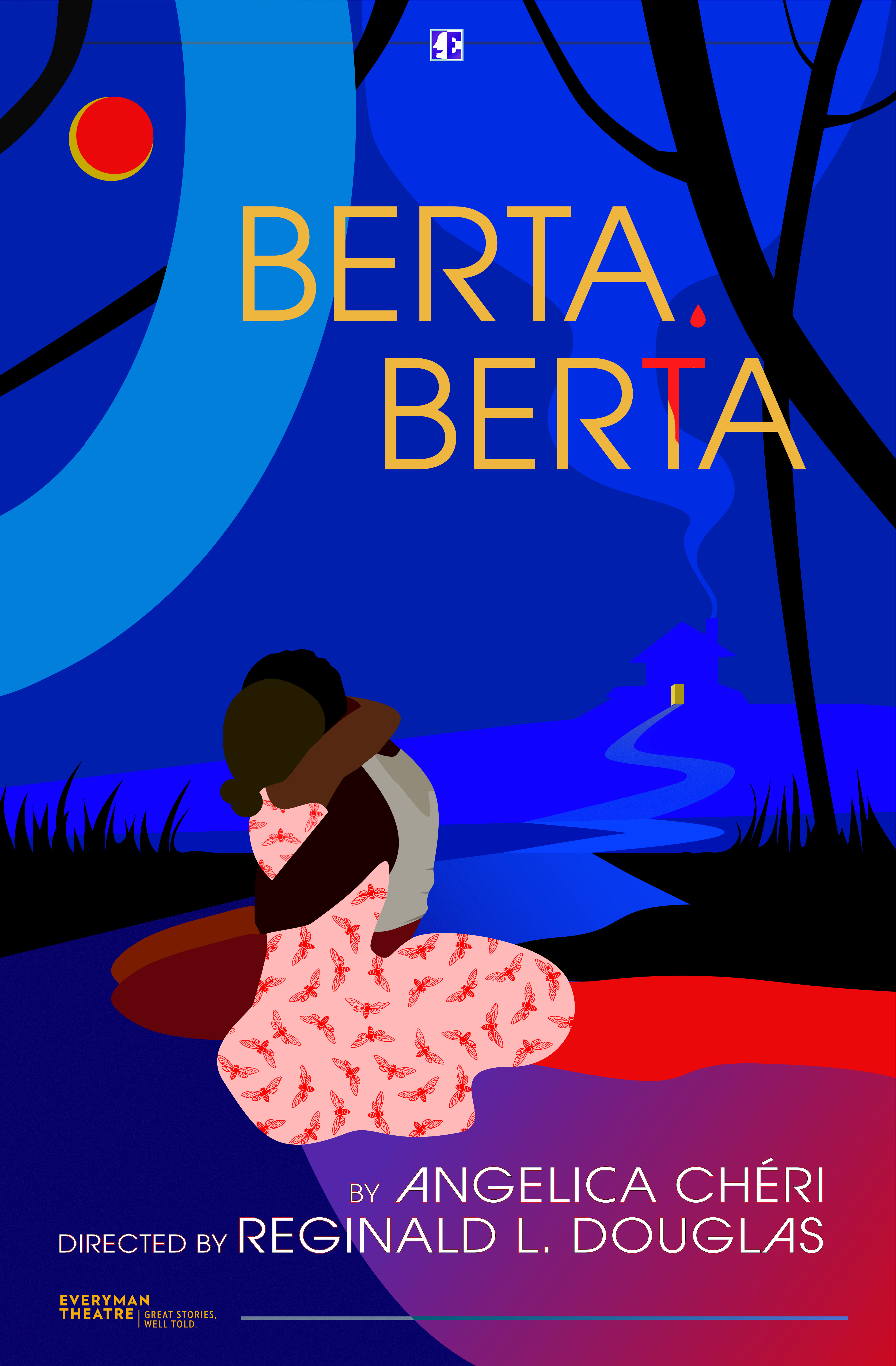
This is an image of a theater poster designed for the Everyman Theater Company's 30th season, specifically, of the production "Berta Berta". The illustration is in a flat style, and features a black couple embracing in the moonlight. Part of a "3" and is woven into the colorful background.
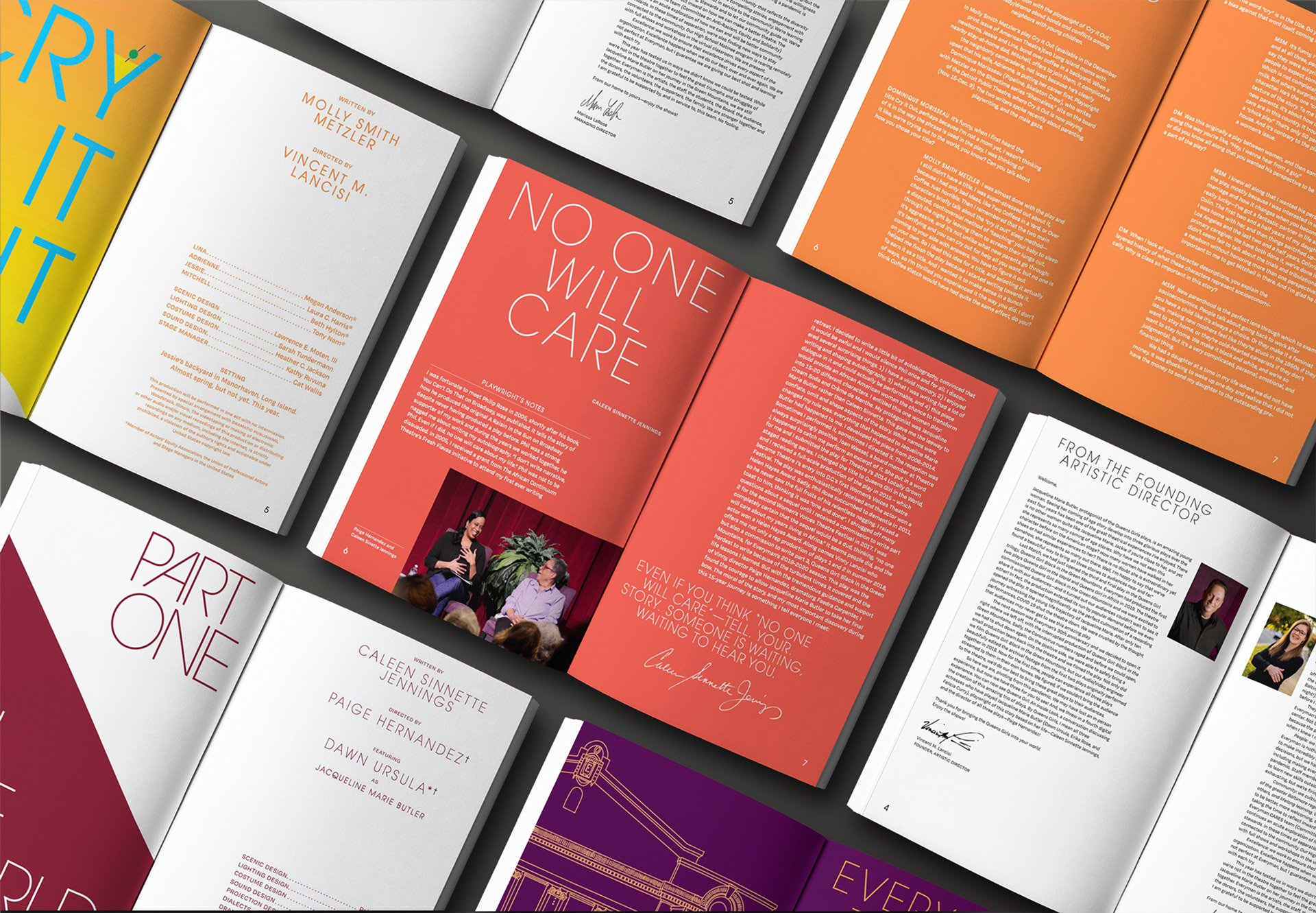
This is a mockup of the Everyman Theatre Company's 30th anniversary editorial spread, in a grid with seven spreads visible.
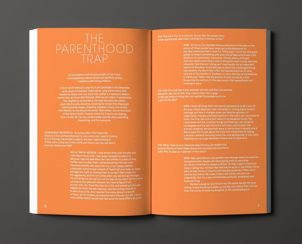
This is a mockup of the Everyman Theatre Company's 30th anniversary editorial spread. This page is orange and features an article entitled "the Parenthood Trap".
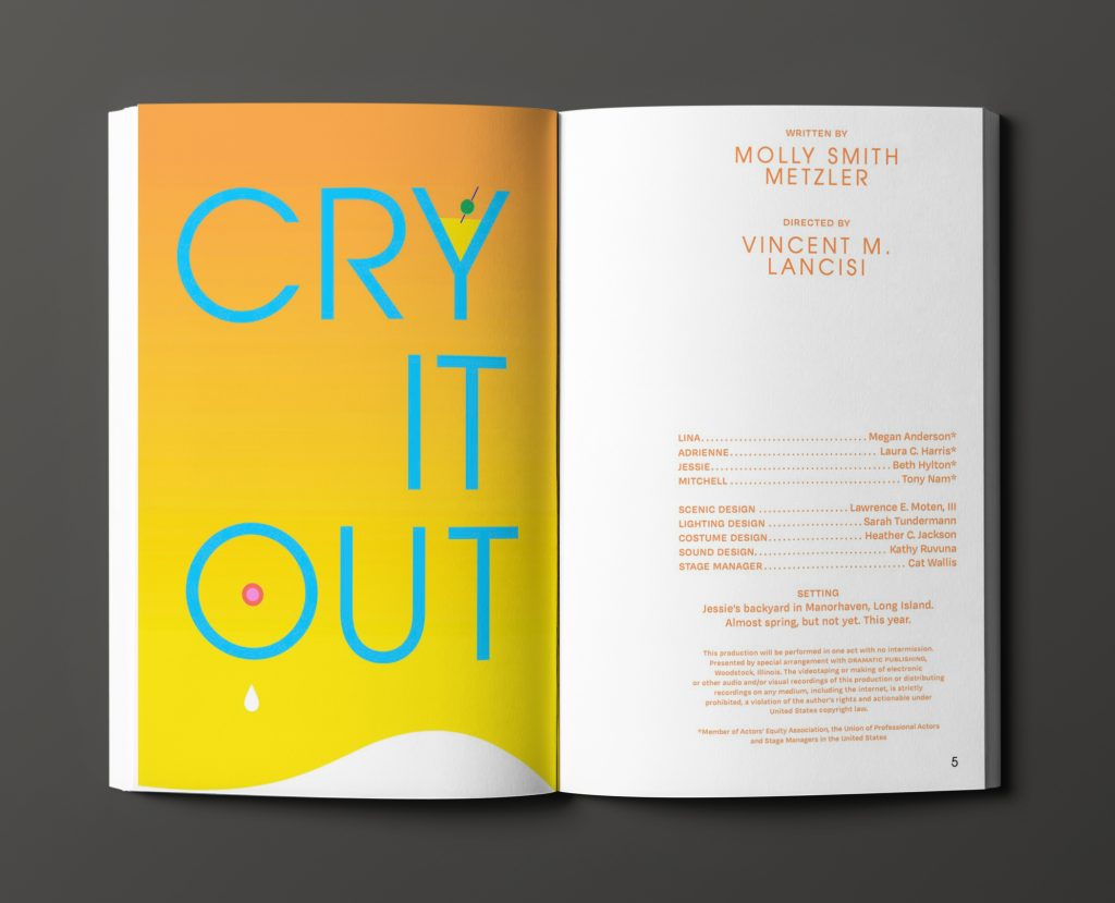
This is a mockup of the Everyman Theatre Company's 30th anniversary editorial spread. There are two pages in an open booklet: one has a yellow to orange gradient and features large text that says "Cry It Out", the page opposite features the credits for the article on a white background.
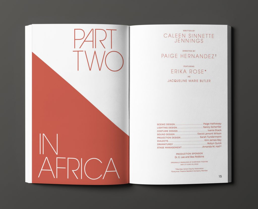
This is a mockup of the Everyman Theatre Company's 30th anniversary editorial spread. This page is split down the middle by a red section and a white one. The text reads "In Africa: Part Two".
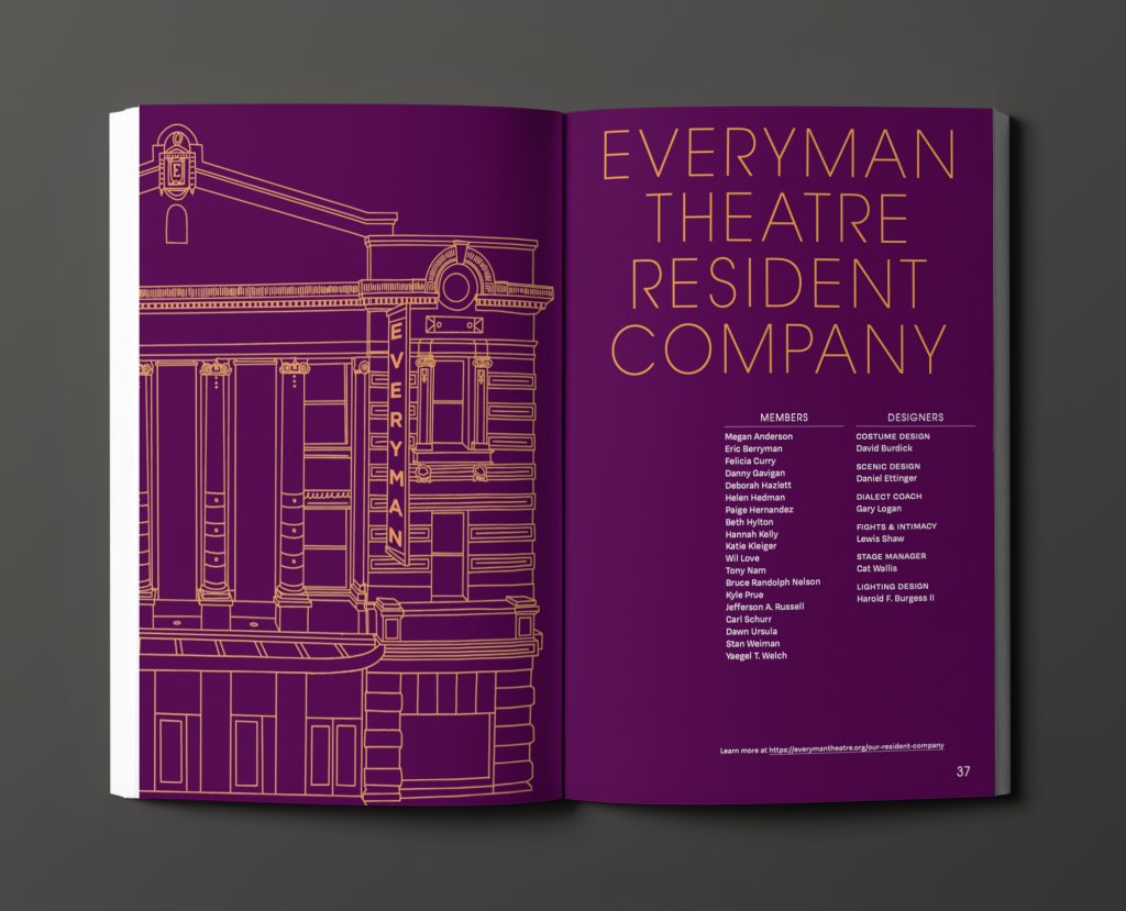
This is a mockup of the Everyman Theatre Company's 30th anniversary editorial spread. This page is dark purple and features an architectural outline of the playhouse, as well as the managerial credits of the company.

Keep Exploring

Best Summer Ever
Best Summer Ever
Making a cheeky movie-musical sing.
Hands On
Hands On
Reinterpreting the next act for an industry leader.
Trinity Repertory Company
Reinventing the public square.