Humboldt Farms
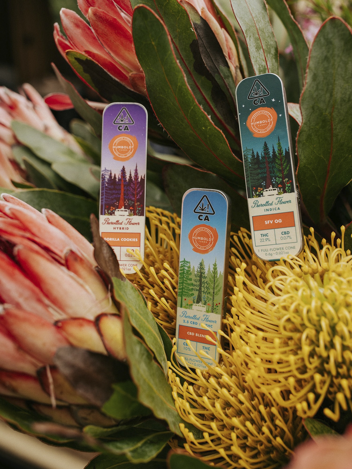
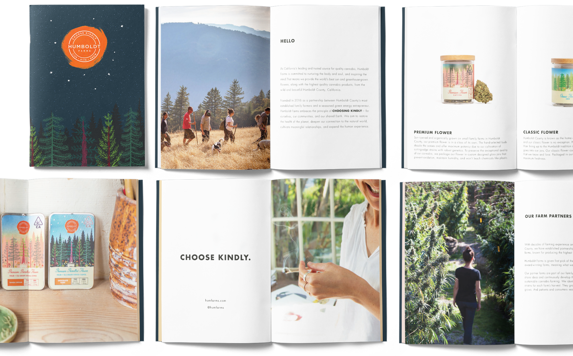
Not since Prohibition has such a taboo product entered the national marketplace. As California’s leading organic and sun-grown cannabis company, Humboldt Farms aimed to create a brand identity in line with its core values: accessibility, community, holistic health, magic and whimsy, connection to nature, and their motto of ‘choosing kindly for the planet and ourselves.’
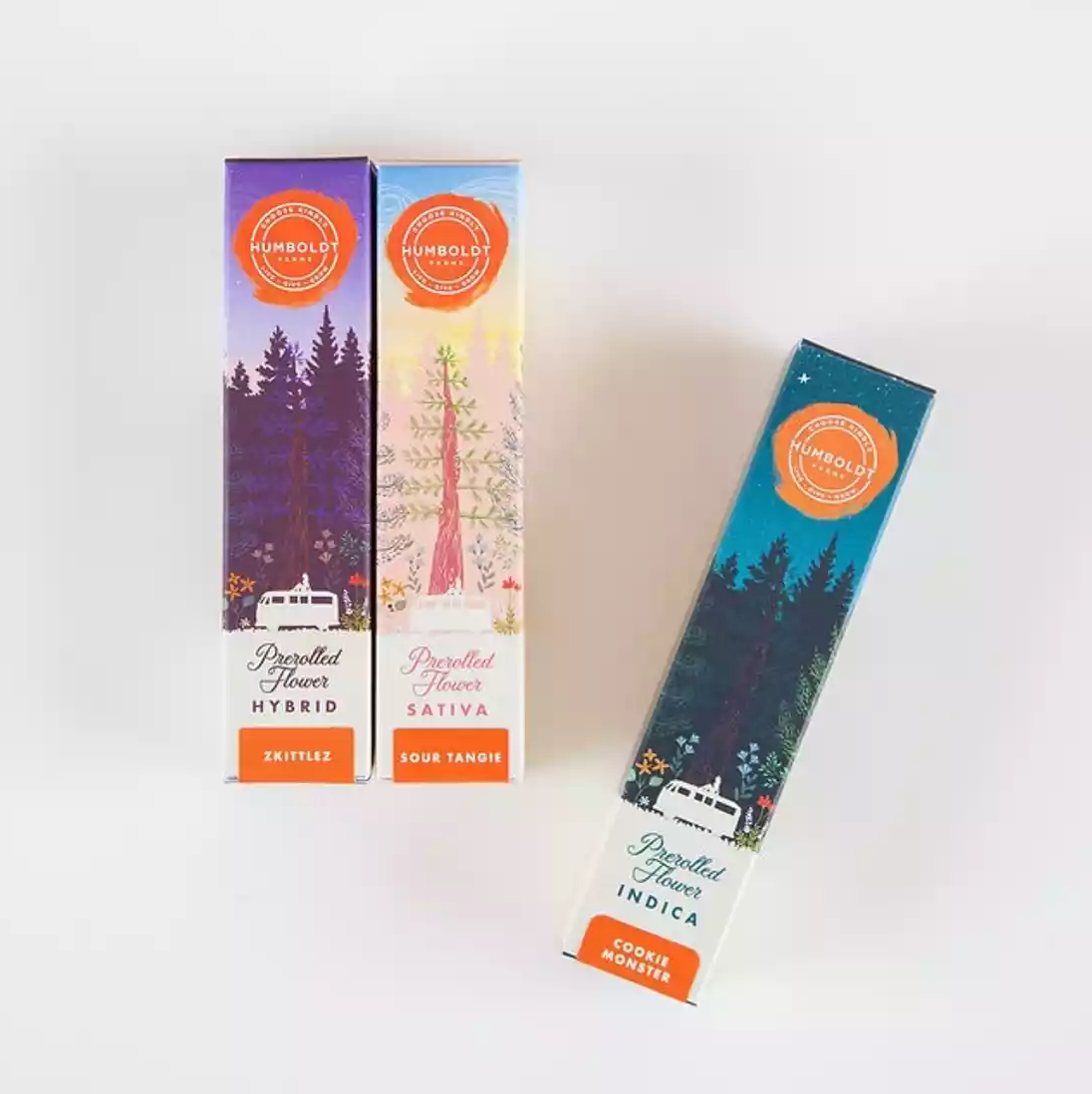
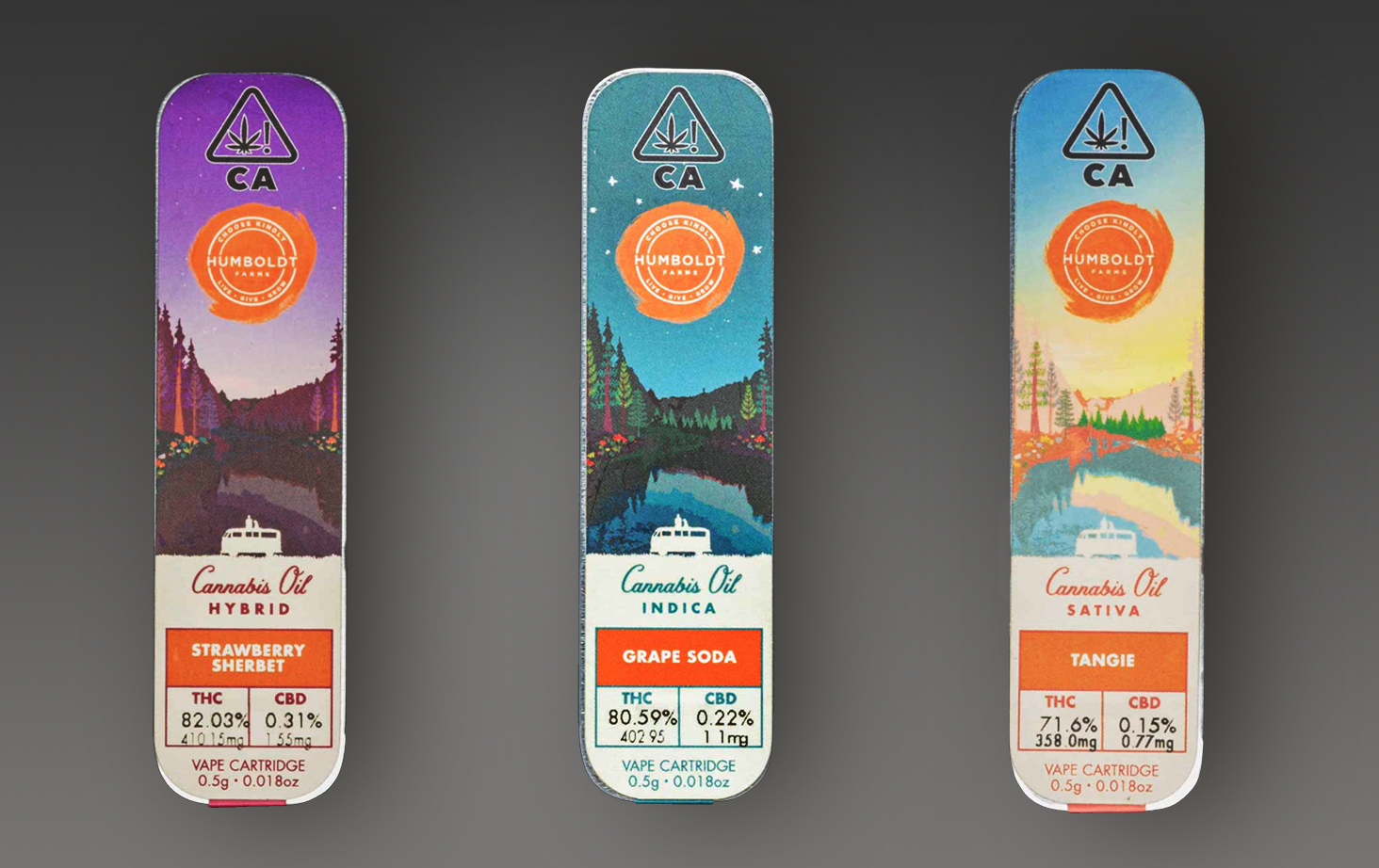
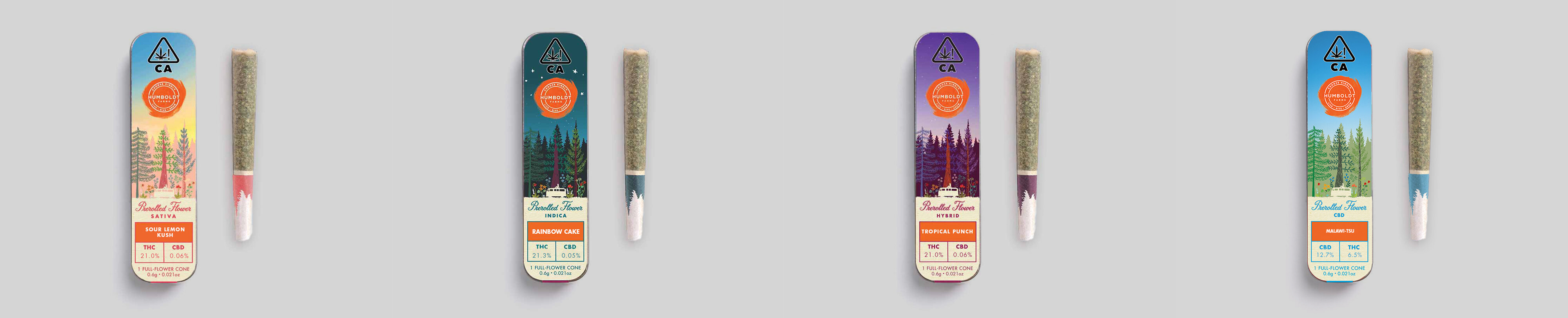
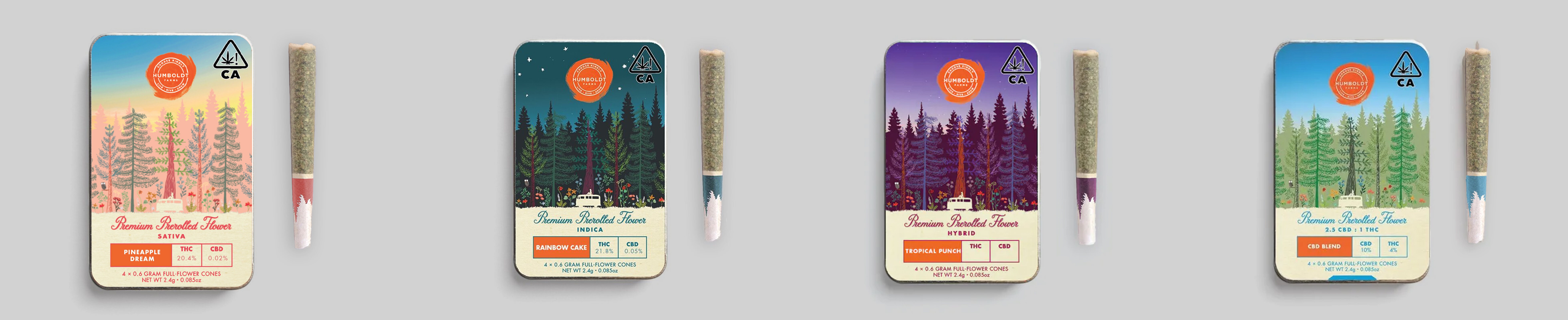
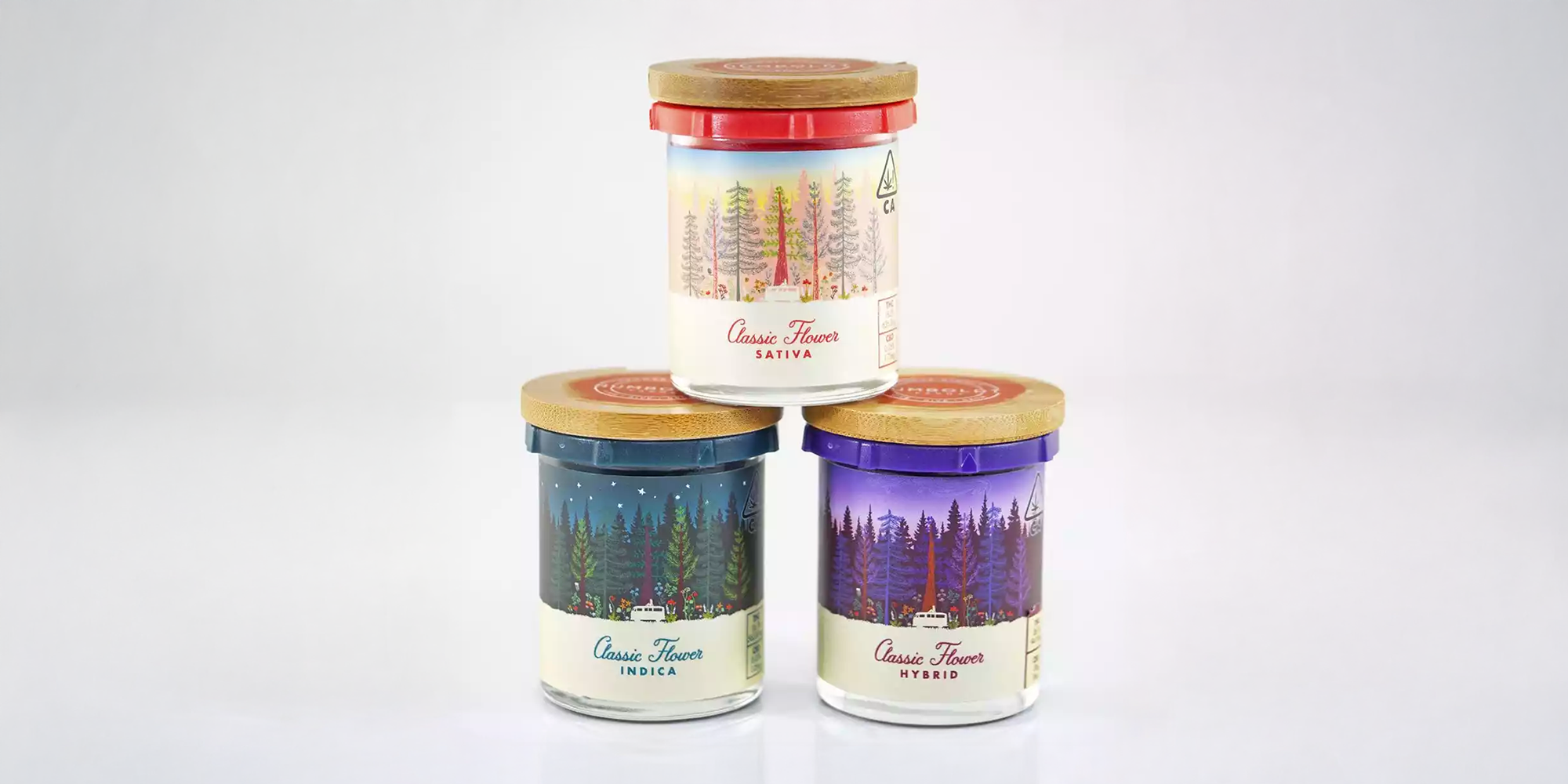
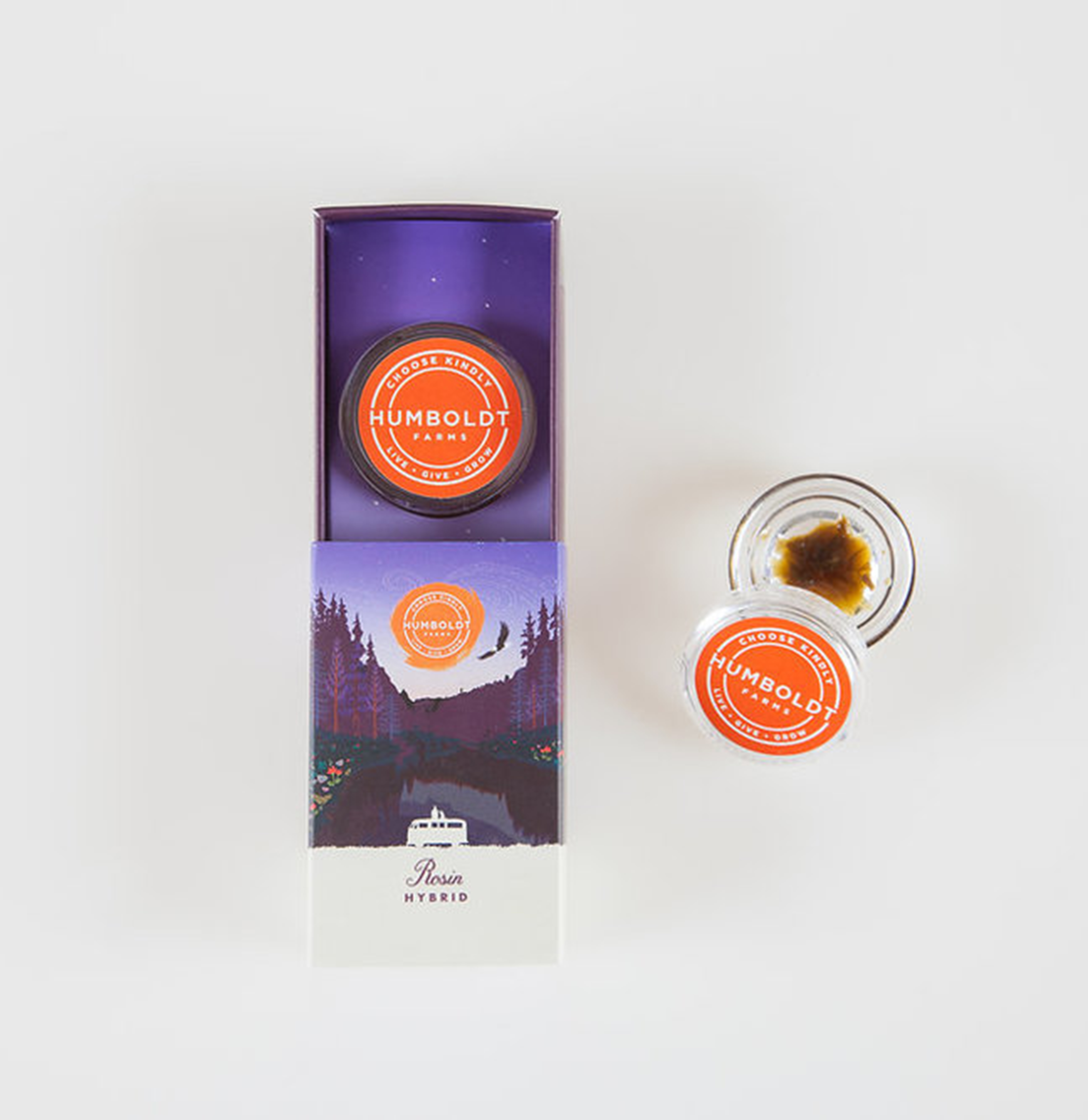
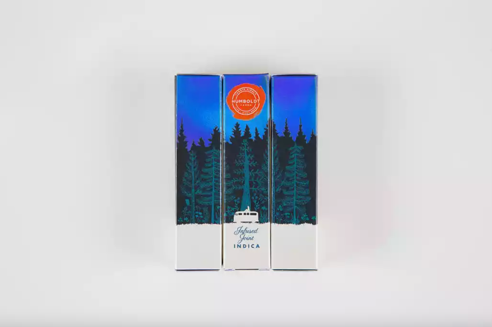
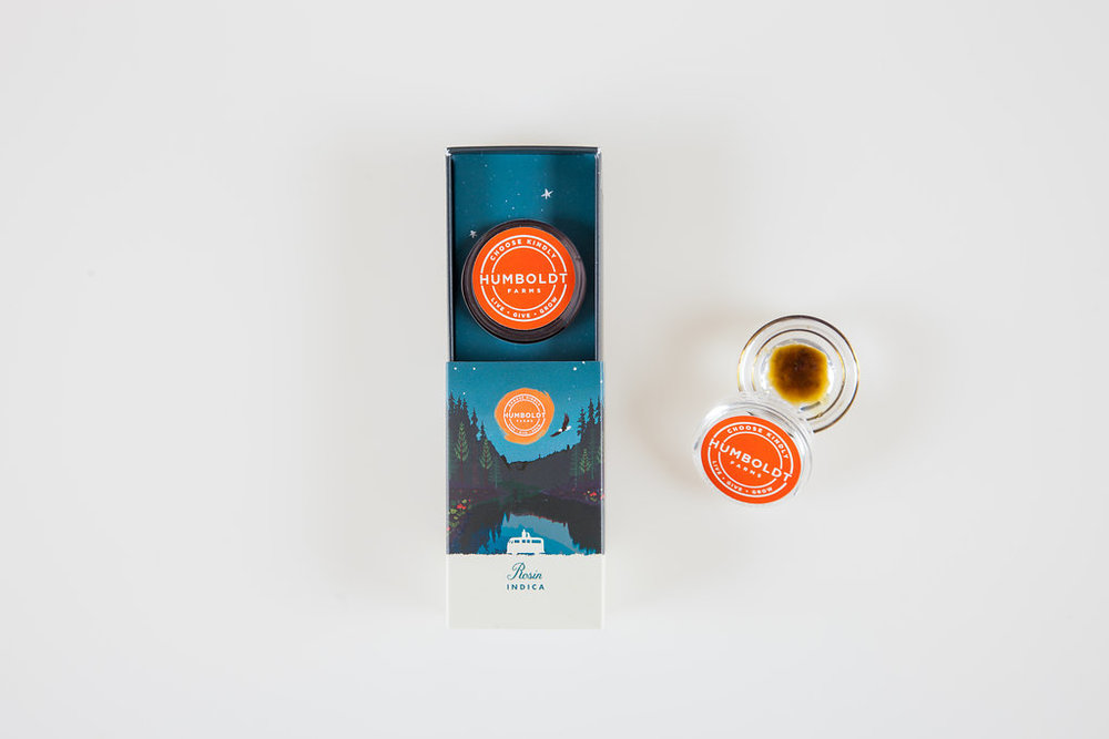
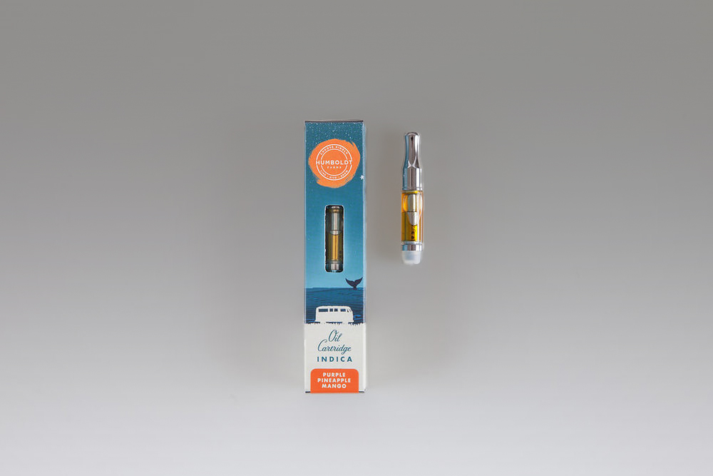
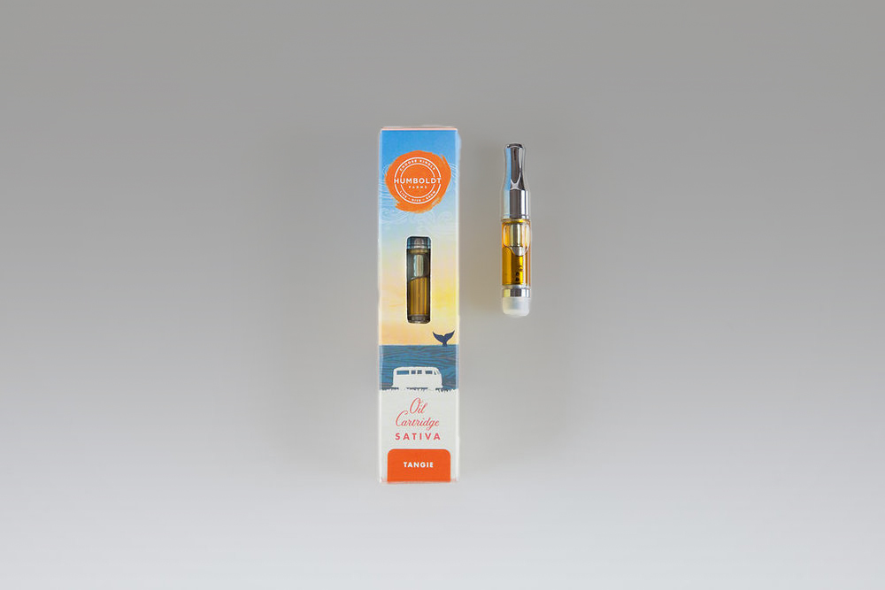
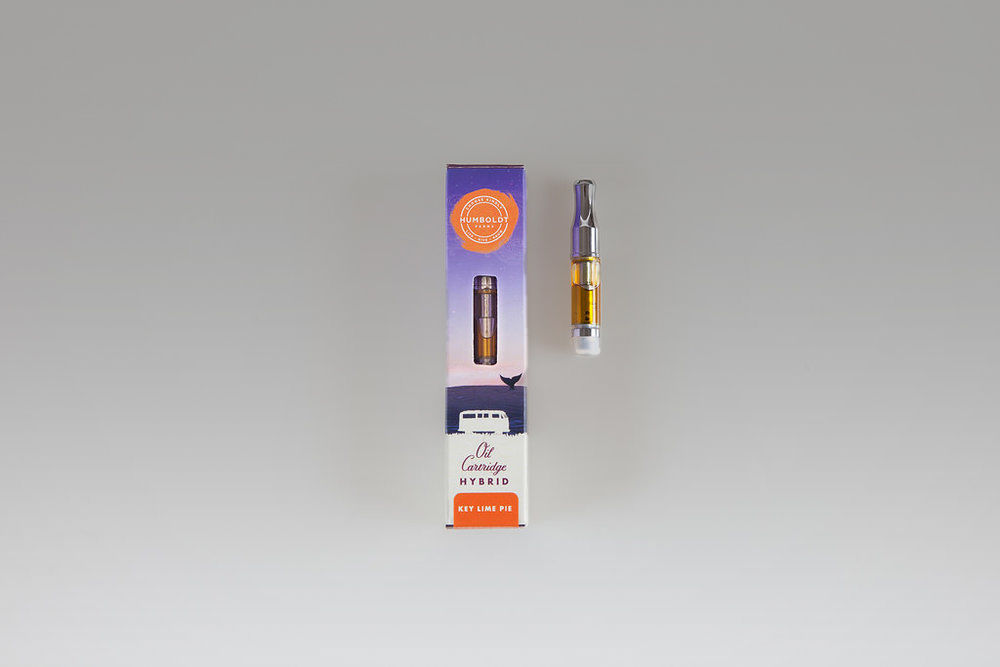
The identity centers around the iconic Humboldt Farms VW Vanagon, which retains its anchor as an emblem of freedom, adventure, and connection to the natural world.
____include all types of packaging
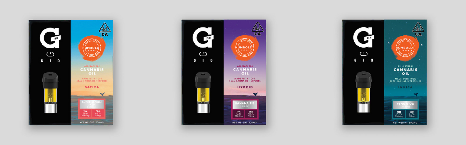
As the van travels across local Humboldt County locations, the effect of each Humboldt Farms product – whether elevating, calming, community-oriented, meditative, celebratory – is reflected in the sky and scene in which the van appears, either solar, lunar, in motion, or calm.
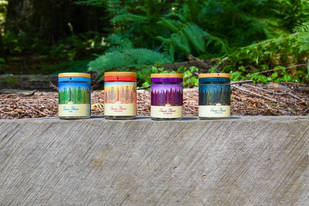
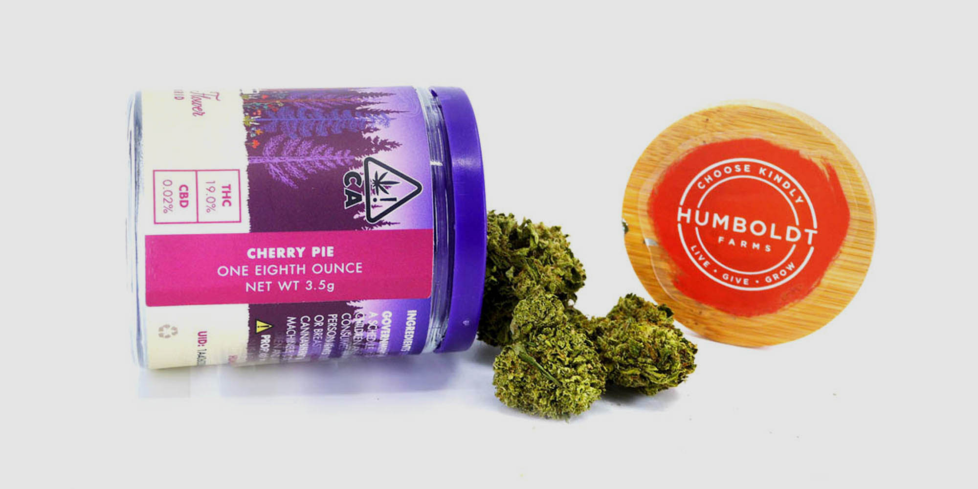
The Humboldt Farms logo reigns over each illustration as a sun or moon depending on the product’s intensity, effects, or health benefits. All packaging is 100% recyclable and sustainable in its design, production, and disposal.
Health + Lifestyle
Identity, Packaging, Art Direction, Motion, Illustration, Communications, Positioning
Jacob Kemp
Zach Rubin, Co-Founder
Dominic Gabriel, Co-Founder
Liz Lux, Co-Founder
Aimee Epstein, Director of Marketing & Creative
Lisa Curiel Parker, Senior Marketing & Communications Manager
Tom Tor, Graphic Design
Aimee Epstein
John Sabel
Elaine Tajima
Photo Credits
© Humboldt Farms, Styling by Aimee Epstein
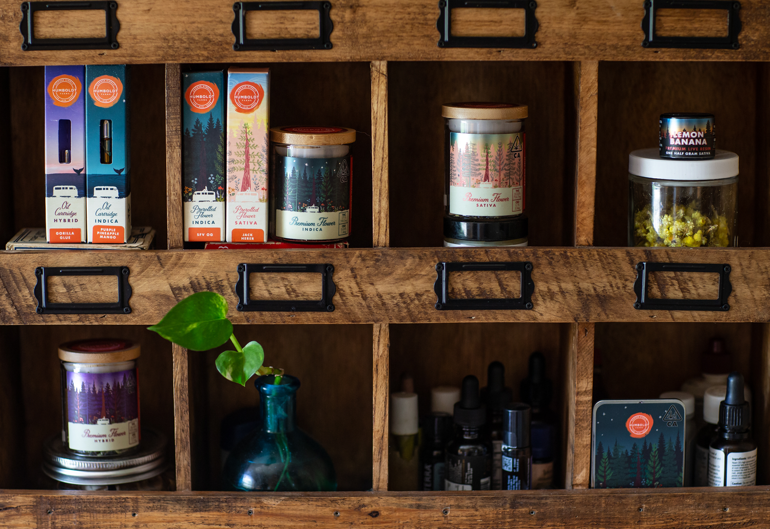
As the van travels across local Humboldt County locations, the effect of each Humboldt Farms product – whether elevating, calming, community-oriented, meditative, celebratory – is reflected in the sky and scene in which the van appears, either solar, lunar, in motion, or calm.

Keep Exploring